Oink
August 2023 - December 2023

Teammates
Lucy Bell
Hyeonseok Lee
Hoyeon Lee
Sunwook Kim
Context
This is a collaboration with NH Bank Korea under the theme “Life Finance Platform Service Design”. The basic idea is that how can we design financial experience that makes life better.
Oink is an attempt to reshape the financial experience for kids and preteens. The problem with the current financial experience is that it is so… in the air, in a sense that you cannot really touch it; the money you have is just numbers on the screen.
It may make sense for adults that have to manage their complex finance (I am also trying to learn how to be financially responsible) but it does not make sense for kids who just started to learn about money. So, what we’re trying to do was bring back some of charming characteristics of physical money to digital banking tools for children.
Overview and Background
Primary Research
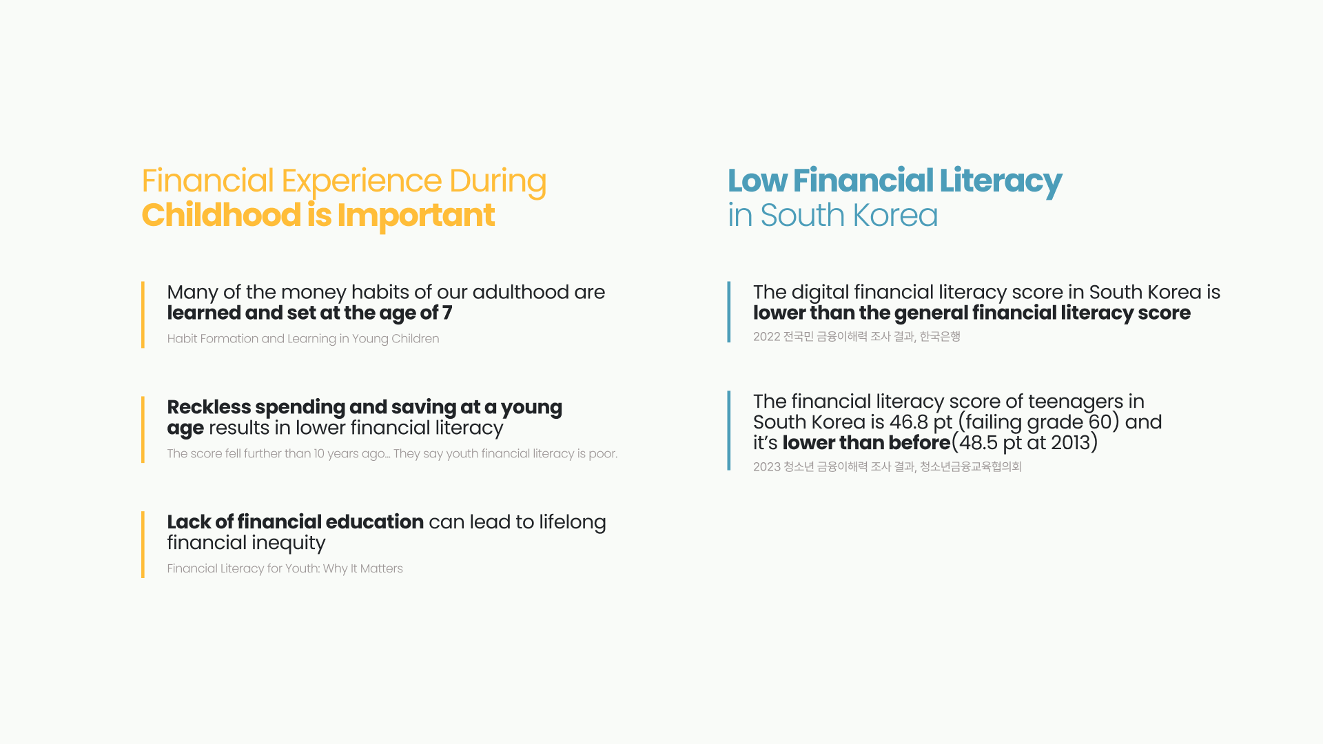
After our initial research, we came to realize this problem from the two observations
- Financial experimenting during childhood is important
- The financial literacy in Korea is low (and I believe it can also be said for the most part of the world)
Surveys & Interview
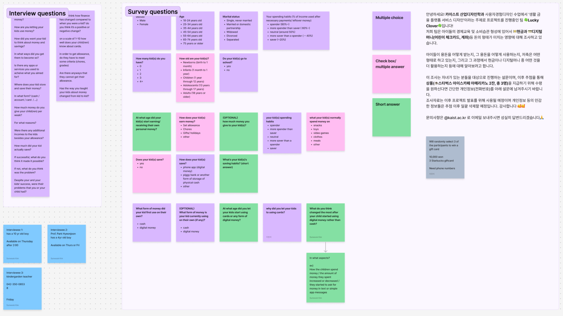
After we had our base hypothesis, we designed a series of survey and interview questions to better define the problem in details.
The result is them compiled and analyze into more digestible presentation.
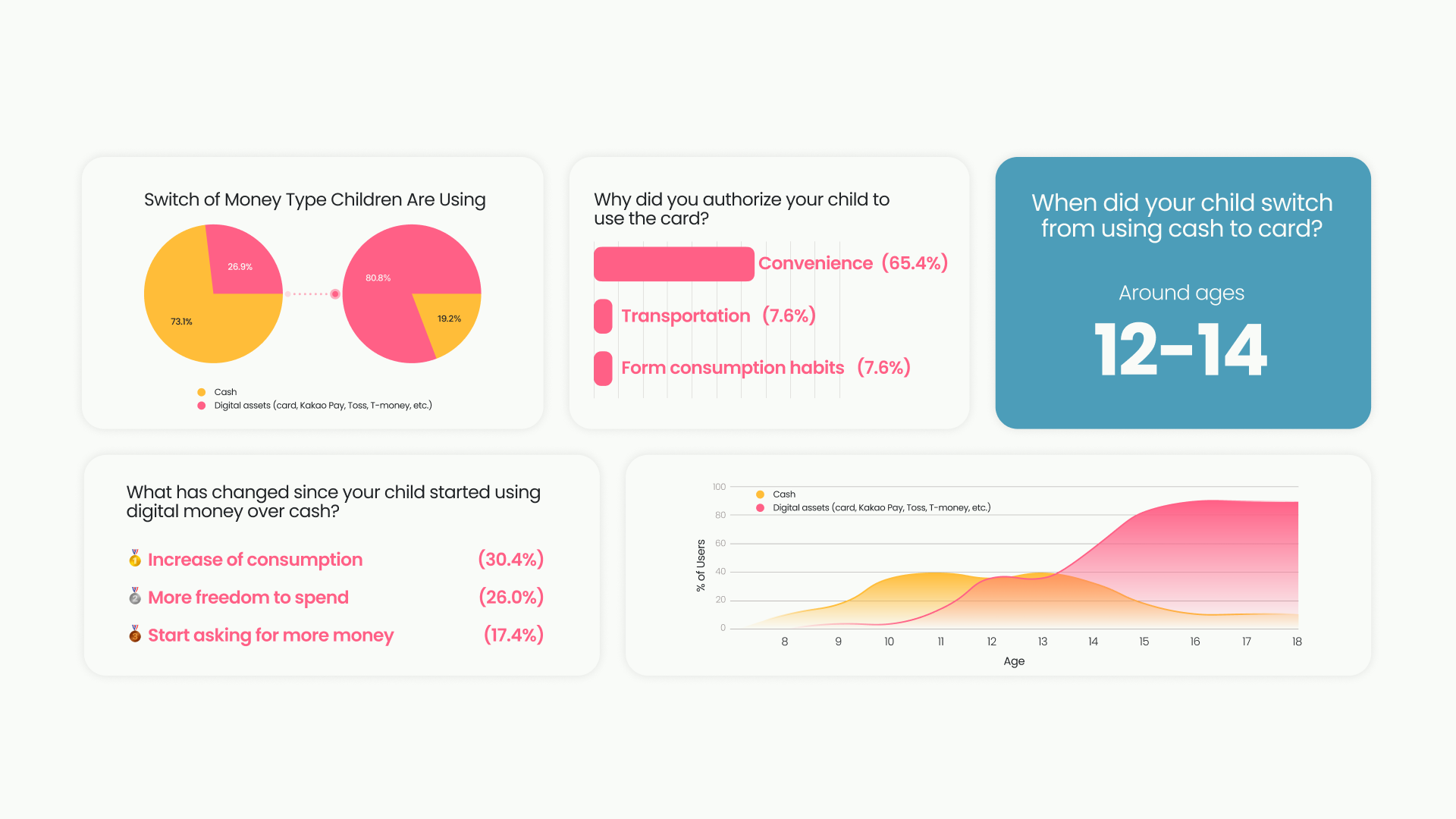
We found that around 50% of children switched from using cash to debit card at around 12-14 years old. The main reason they make the switch is because of convenience.
The interesting part is what changed after they started using digital money. There are some positive changes like the children gets more freedom to spend but that eventually leads to negative effects like overconsumptions and lack of planning.
Problem
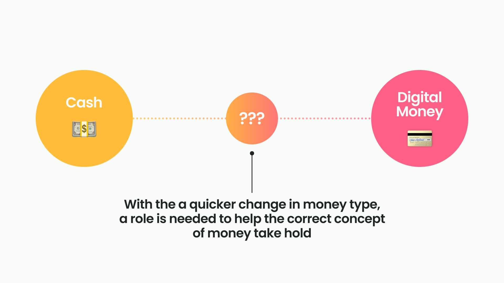
The problem we see here is that the change from physical money to digital one may be too sudden. From physical assets that you can see, reduced to just a numerical representation on a screen.
In order to better encourage good financial habit since teenage year, maybe a better transition to help children acclimated themselves to the digital financial world.
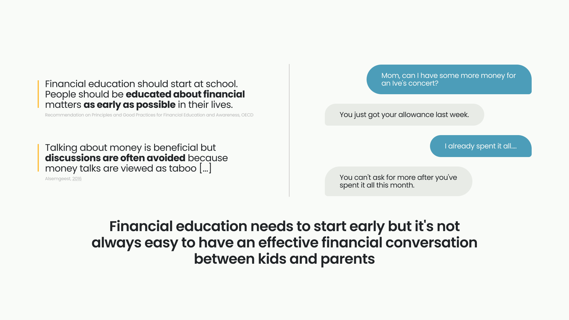
Another problem is that financial education needs to start early but it’s not always easy to have an effective financial conversation between kids and parents.
And that’s the overarching theme of out problem; “Transition Period of Cash to Digital Money”
Target User
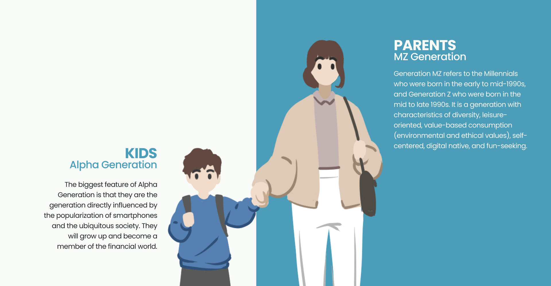
So, we decided our target user to be 7-13 years old kids and their parents. If the product is expected to ship in 4-5 years, they would be
Kids
Alpha Generation
The biggest feature of Alpha Generation is that they are the generation directly influenced by the popularization of smartphones and the ubiquitous society. They will grow up and become a member of the financial world.Parents
MZ Generation
Generation MZ (a South Korean specific term) refers to the Millennials who were born in the early to mid-1990s, and Generation Z who were born in the mid to late 1990s. It is a generation with characteristics of diversity, leisure-oriented, value-based consumption (environmental and ethical values), self-centered, digital native, and fun-seeking.
Goals
We set some goals and objective for each goal so we have a common understanding among members and other stakeholders.
- create a seamless transition from physical to digital money
to achieve this we need to- Help them understand the value of digital money
- Visualize digital money
- Simulate the physical manipulation of digital money
- Form good money management habits
to encourage good habits we need to- Make savings appealing
- Foster thoughtful spending and saving
- Encourage conversations about money between kids and parents
- Provide talking topic and common place to talk
Ideation
Ok. Now we have our goals and objectives, let’s think about how to achieve them.
To better formulate and shape the solution, we tried to draw inspiration from the problems.
With the results from surveys, interviews, and literature reviews we decided to separately analyze the problem in 3 areas of personal finance for kids:
- Earning
- Spending
- Savings
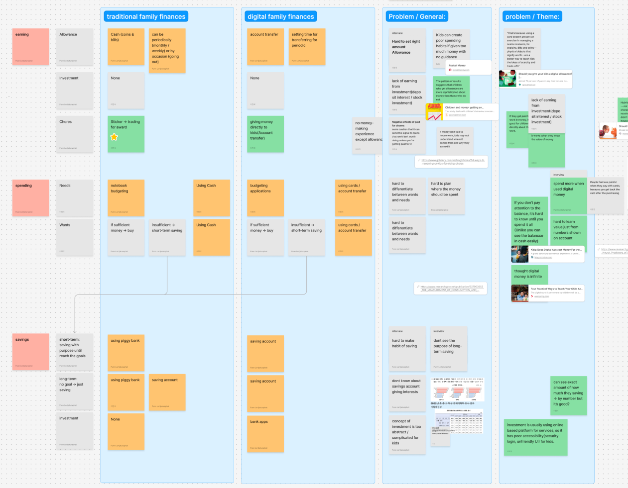
Then we create an affinity diagram of the painpoints.
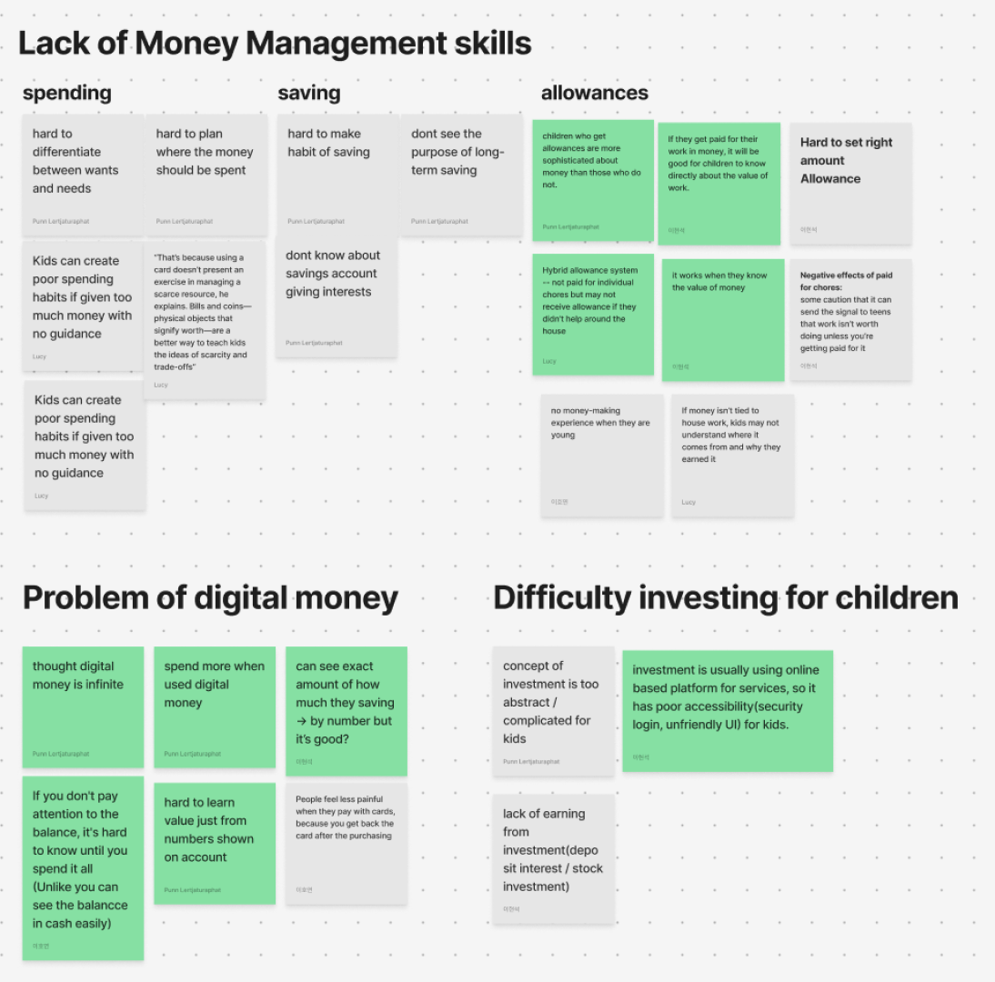
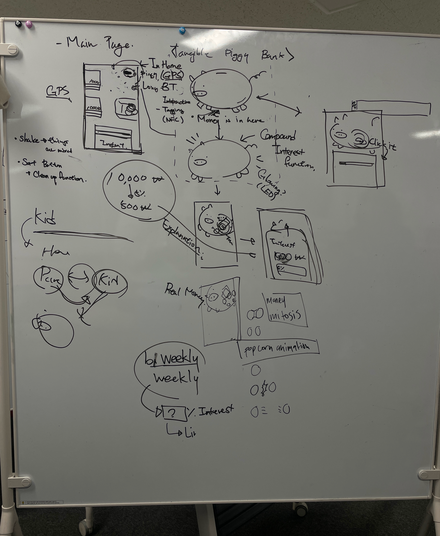
The recurring theme found in the post-its are that digital money sometimes are too abstract. So, after some weeks of researching, we came upon a promising solution; “Tangible User Interface”.
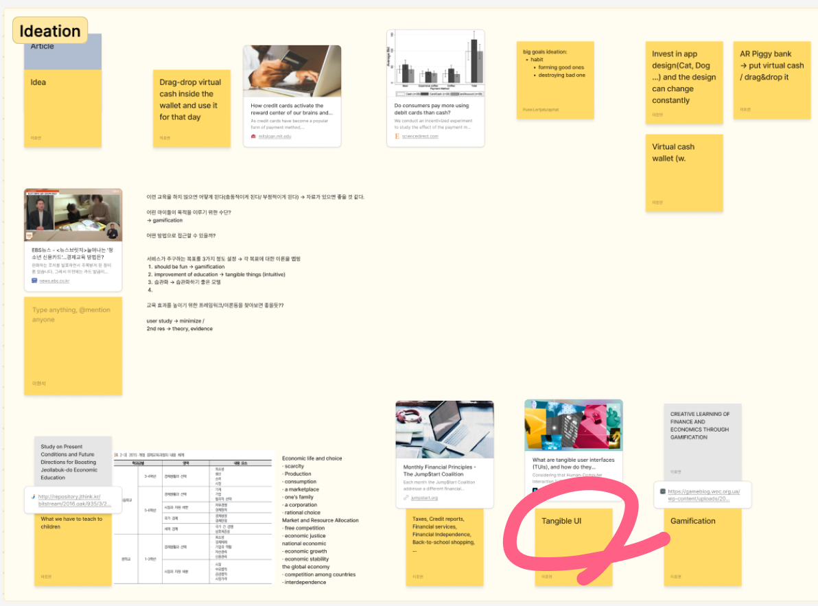
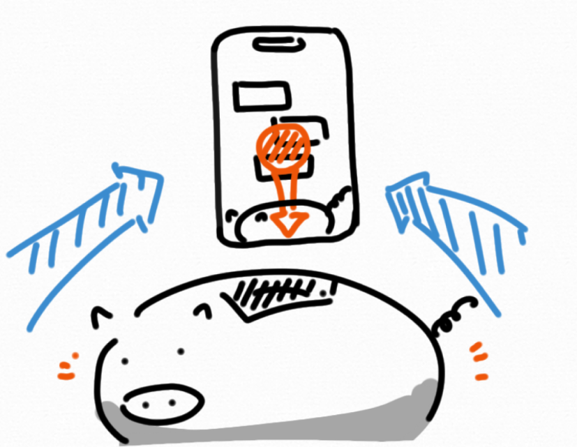
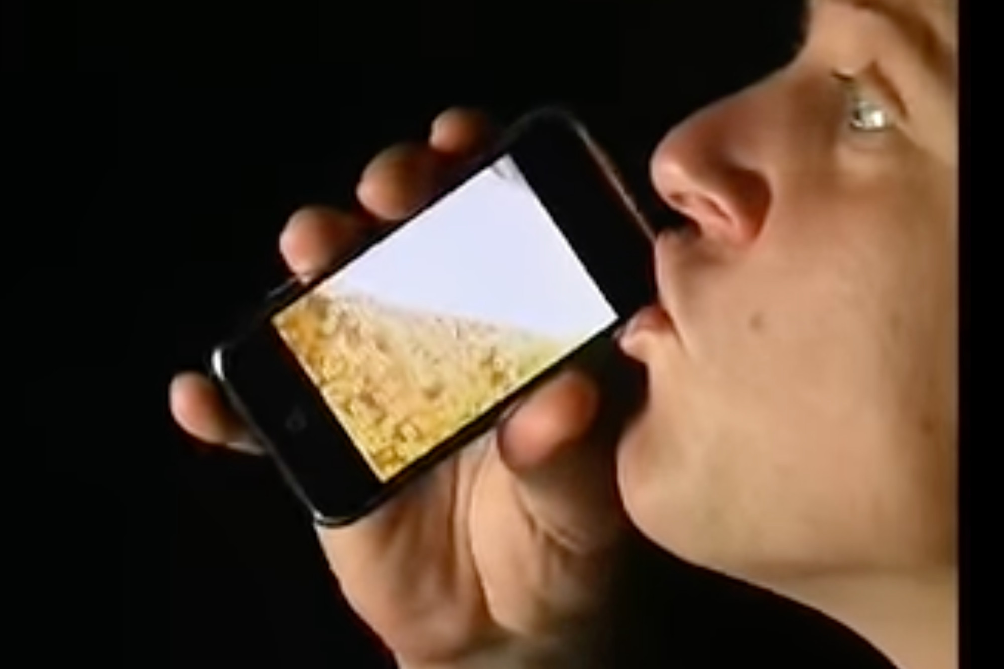
The initial idea is that we have a physical piggy bank that kids can pretend to drag the money on their mobile screen and drop them into the piggy bank as if they are putting real bank notes into the piggy bank. (Like some of those weird apps from the early era of smartphones that let you pretend to be drinking beer out of your phone.)
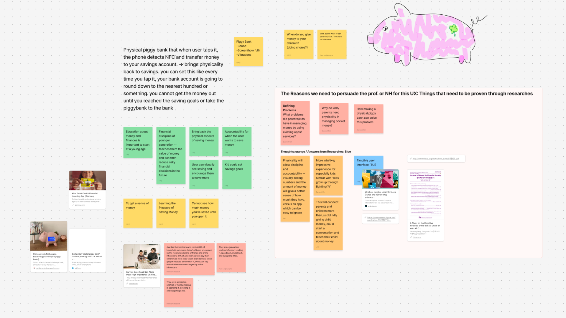
Which is cute but it didn’t fully answers all of our goals. But it got the ball rolling! We ended up liking the potential user experience of this idea so much that we started to build the solutions around it.
What if dragging around bank notes icons isn’t just contained in the saving interface, but it is the main idea of this financial interface?
Design
With that in mind, we divided the team into 2 parts: one developing a rough Information Architecture (IA) of the system while the other gather references and moodboards.
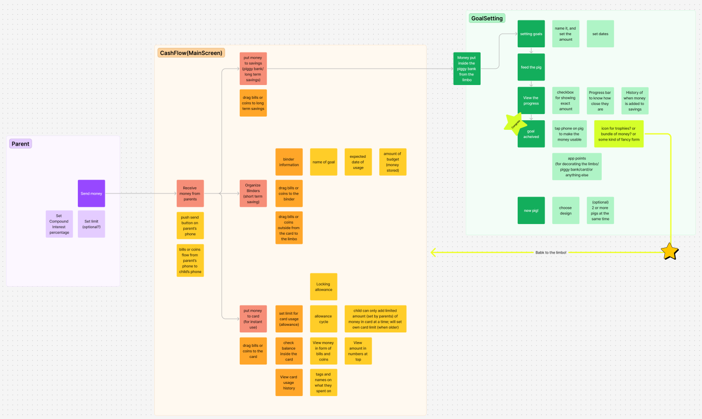
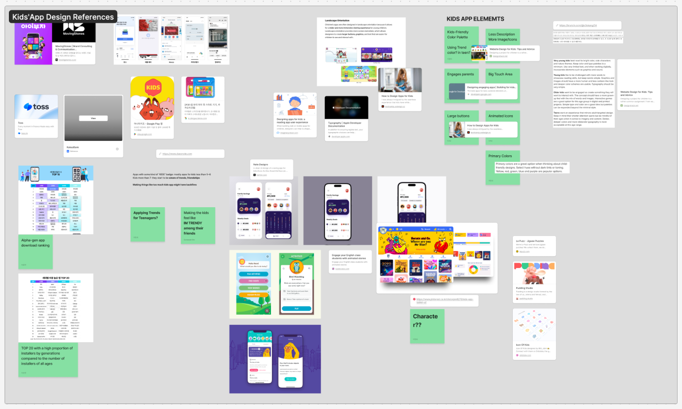
Then we started to design and iterate through the interface. This is how one iteration looks like.
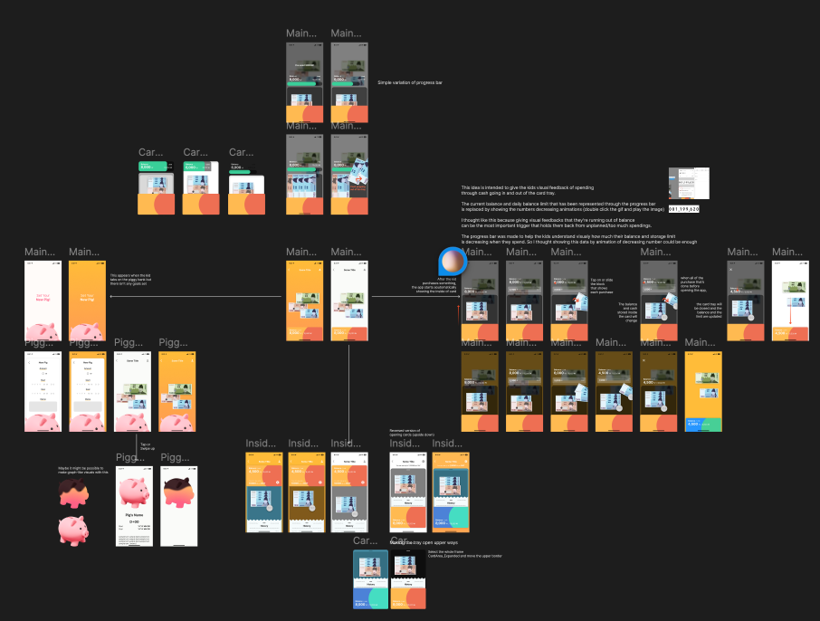
After each iteration, a team meeting is organized and we go through the user flow together. I had so much fun in this process
because we get to disect the prototype with the teammates, discuss the rationale behind each design or interactions, and defend your own design.
Final Product
And after a month of iterations discussion, out of our blood, sweat, and tears came
It might be better for your experience if you see this video before we dive into the product.
Home Page - Kid’s UI
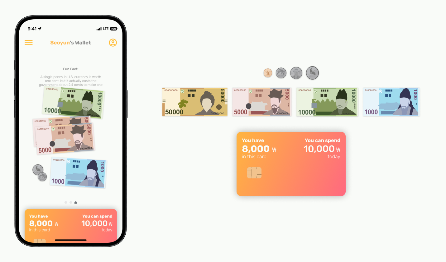
Filled with draggable bills and coins representing the amount the child currently has in their bank account
Drop shadows on the bills and coins make use of the existing mental model that the objects are draggable
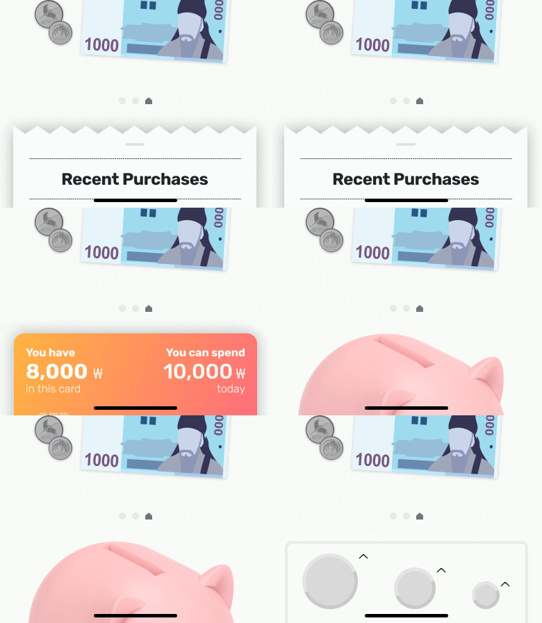
Bottom Navigation
Swipe left or right to navigate between components and click to view details
Wallet - Kid’s UI
Interaction with Bills and Coins
Bills and coins in the wallet can be interacted with in several ways
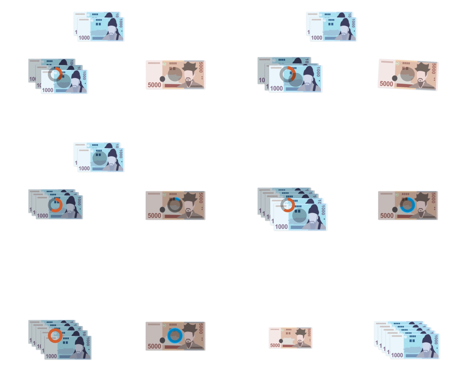
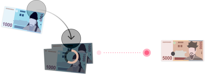
Combining Bills or Coins
Long press and drag bills or coins together to combine into a larger bill or coin

Dividing Bills or Coins
Long press a bill or coin to break it down into smaller bills
Spending - Kid’s UI
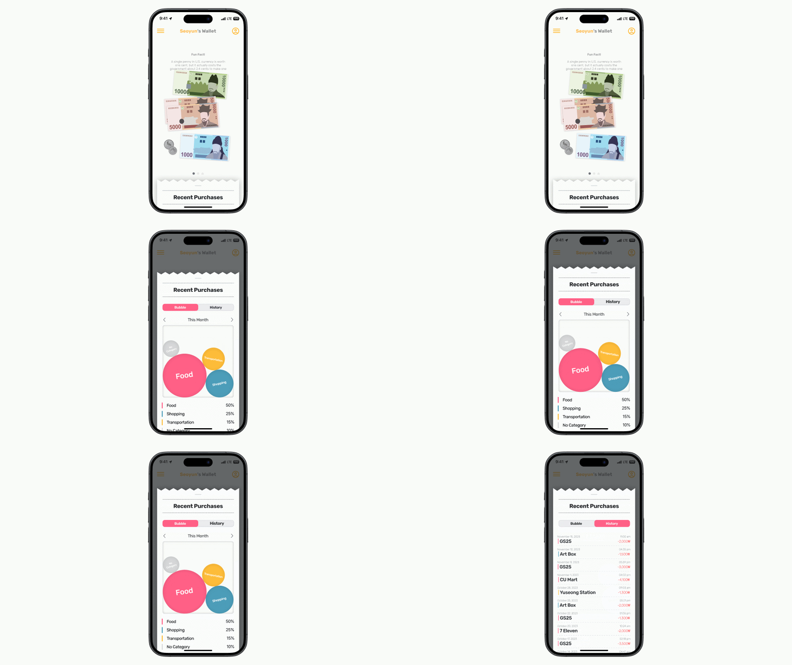
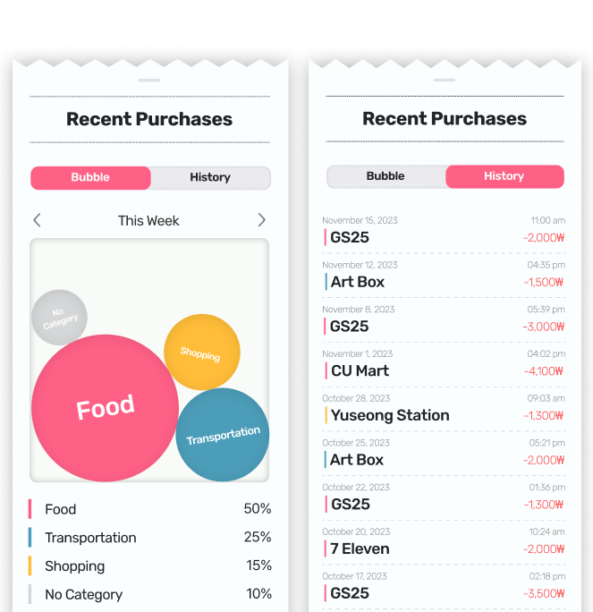
Purchase History
Can easily find any recent transactions and has the ability to filter by week, month, and year
Designed after a receipt slip to make it more familiar to child’s understanding of the world
Card - Kid’s UI
The kid can drag the money they have in their homepage into their card to top-up before any usage. this design choice is to simulate the need to look into the physical wallet before buying anything.

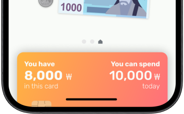
Balance Information
Displayed on the card is the amount in the child’s account and how much of their daily limit is remaining to be used
Use of visually interesting, but simple UX to increase the usability for kids
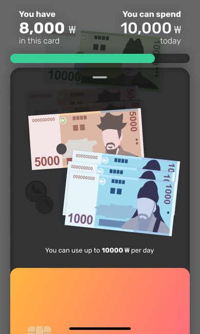
Card Drawer
Drawer pops up from the card to show the balance inside in the visual form of cash
The drawer is hovering on the wallet to enable the user drag the money outside the card
Piggy Bank - Kid’s UI
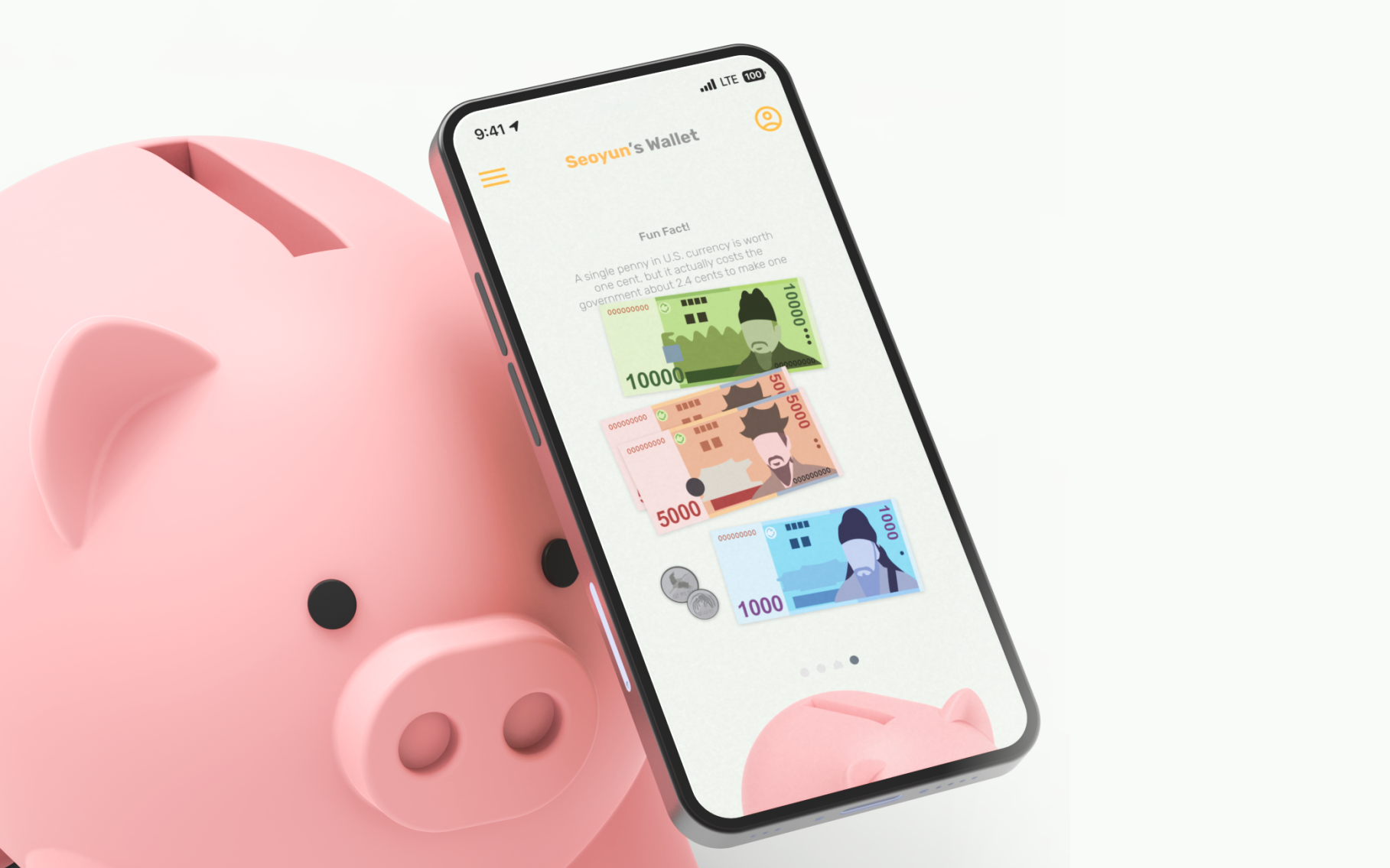
Tag phone on the physical piggy bank making a pig component to appear on the bottom navigation of their phone
On the phone the child can begin planning their goals and saving
“For young users, [digital] interface use is often developmentally inappropriate and can be a stumbling block to interactive learning. Exploring and manipulating physical objects is a key component of young children’s world and of their learning.”
- Revelle et al., 2005
Goals - Kid’s UI
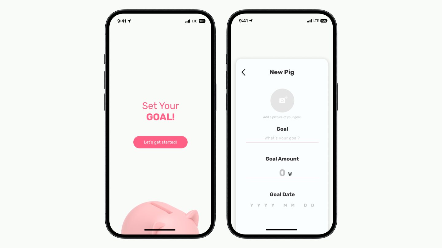
To encourage savings and give them a sense of purpose, the child is able to choose any item they are hoping to purchase and set the amount needed and when they hope to achieve it
“Individuals who vividly put down their goal are 1.2-1.4 times more likely to successfully accomplish their goals”
- Murphy, 2018
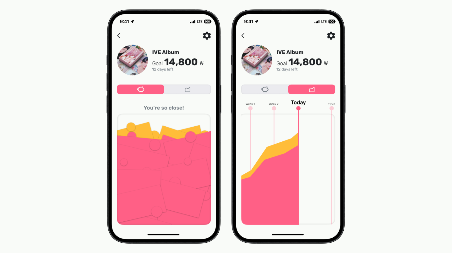
Check on progress towards set long term goal with a visual graph
Money is categorized into actual money saved (represented in pink) and the money earned from the simulated compound interest (represented in orange)
Saving - Kid’s UI
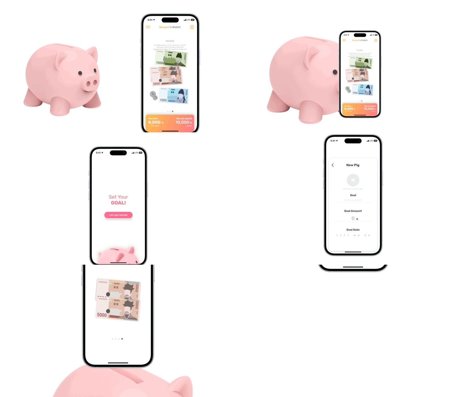
When organizing money into spending, short term savings, and savings towards their goal the child can save in their physical piggy bank
Saving their goal money in the physical piggy bank gives a sense of accomplishment, but also distance, knowing they cannot spend that money
Compound Interest - Kid’s UI

Compound interest is a simple concept that children can easily grasp as their first introduction into the more complex financial world
Compound interest is simulated in conjunction with their parents through their long term savings goal. The interest the child get is going to be from the parents (this is how it is “simulated”) so they have more flexibility in managing the interest rates.
The fun animation brings excitement and attention to the new concept making it easier to learn
Dashboard - Parents’ UI
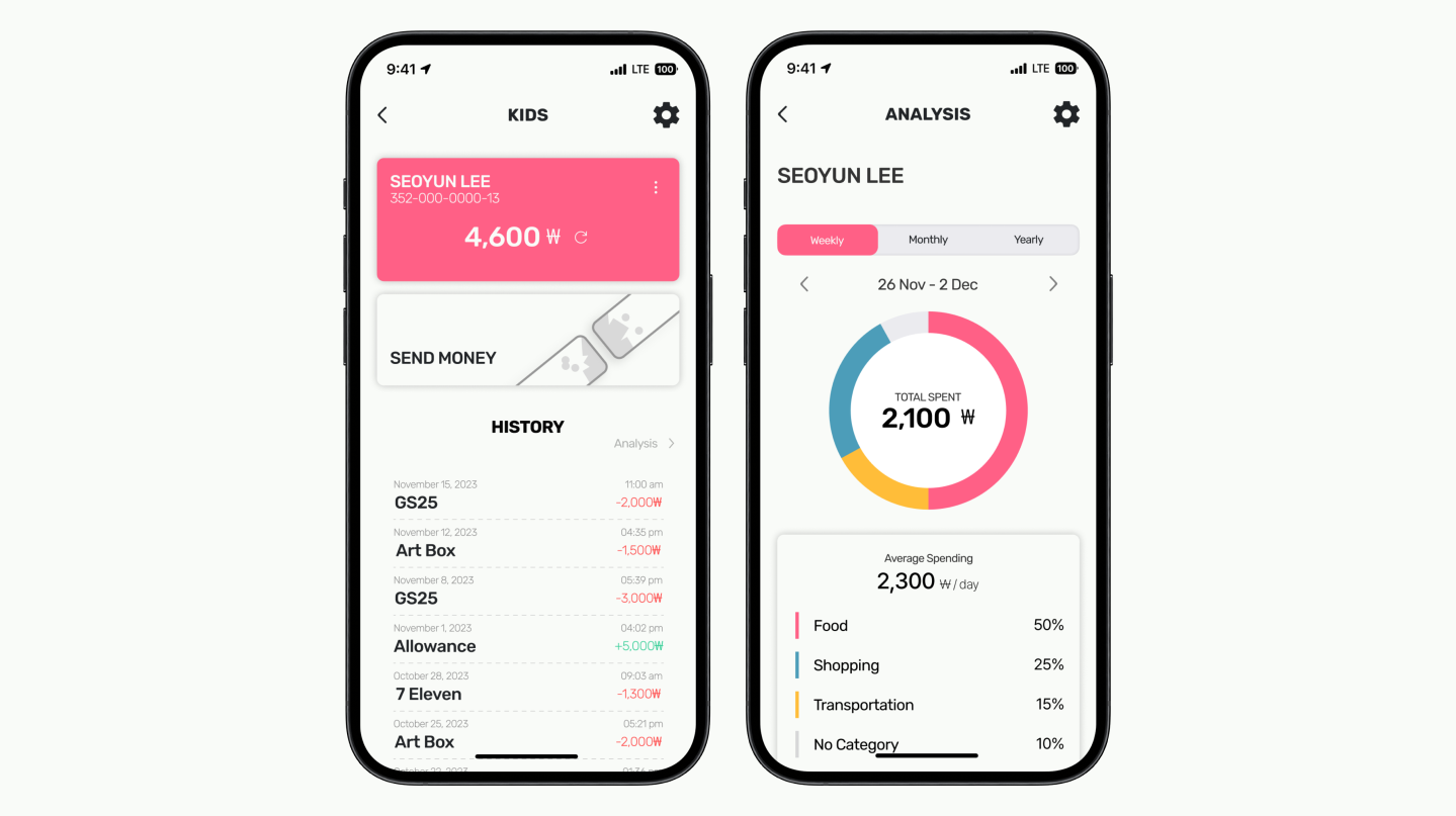
Parents are able to easily track their child’s spending by viewing what’s currently in their account and their recent transactions
These transactions are also broken up by categories and visually shown in a circle graph to determine where their child is spending most of their money
Transfer - Parents’ UI
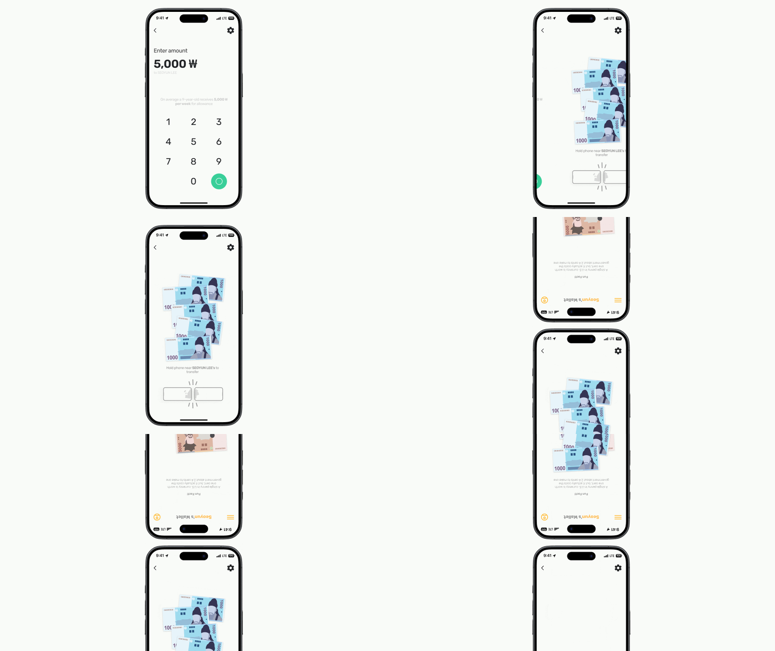
Within the child’s analysis screen, parents are also able to quickly send money to their child
After confirming the amount, the parents is prompted to bring their phone close to their child’s, where the number is transformed into bills so they are able to visually see the money being added to their wallet
Impacts
Individual Impact
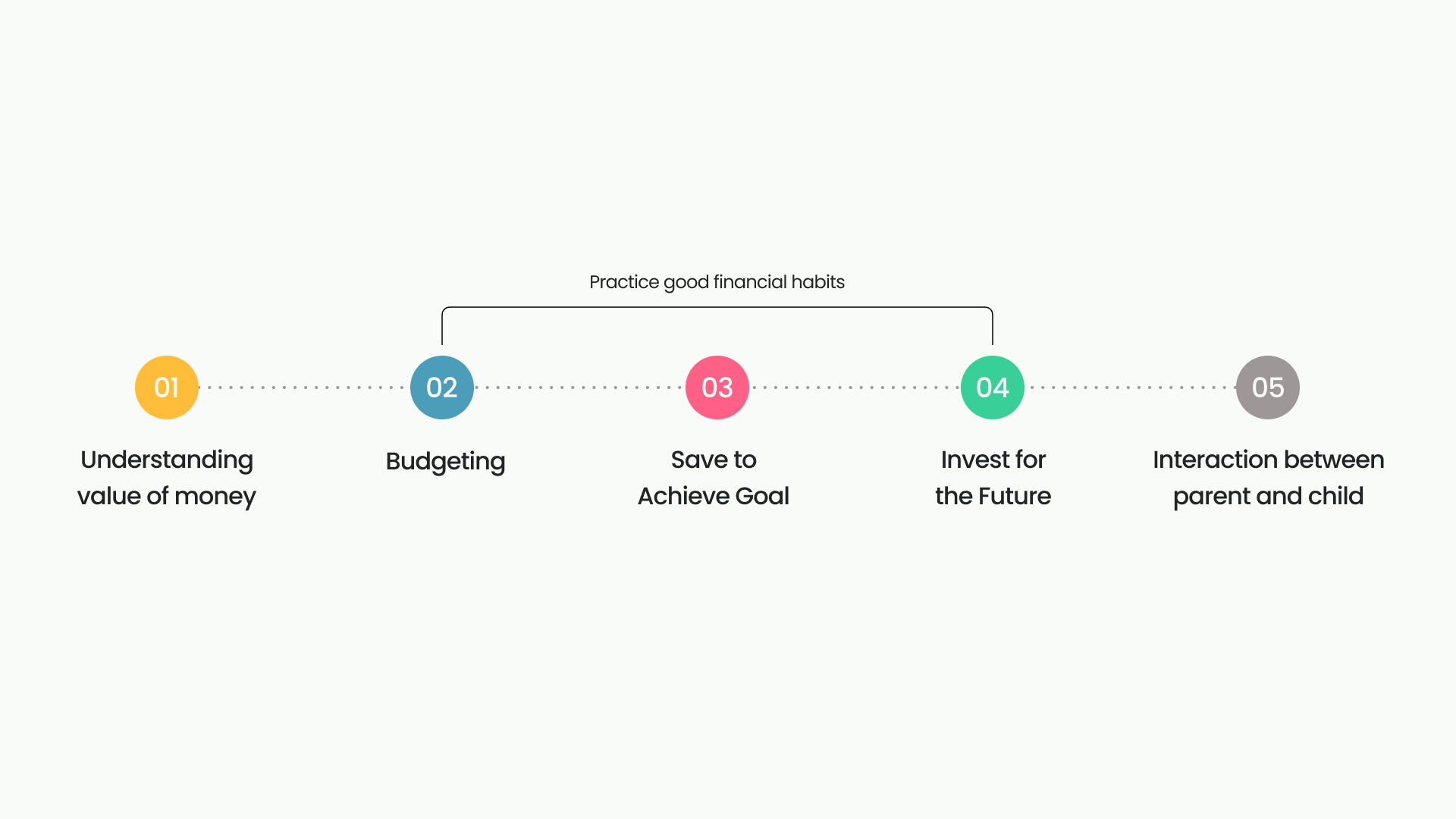
Fill children’s childhoods with healthy financial experiences
Through the experience of moving and exchanging bills and coins, children will be able to perceive money as colors and shapes, not numbers, and as a result will be able to read numerical values.
By stacking and labeling money in their wallet compartments, kids get the experience of practicing planned spending in different areas. They’ll move away from seeing their balance as a number that’s always available to them and start spending with a sense of direction. Kids can save money based on goals, recognize that they can’t spend it, and feel a sense of accomplishment in reaching their goals.
The experience of not spending money right away, but investing it in the future and earning additional interest, can help them weigh immediate happiness against long-term gains.
Parents will be able to have healthy conversations with their kids.
Our app suggests new conversation topics. Your child will be able to set new savings goals and check them off, and you’ll be able to see them and give them more compound interest to encourage them to save.
Instead of getting mad at them for spending a big chunk of money out of the blue, you’ll have the opportunity to understand and praise them for the hard work they’ve put into saving to get there.
You could even meet them face-to-face every time they ask you for their pocket money and have a short conversation about the amount.
Social Impact
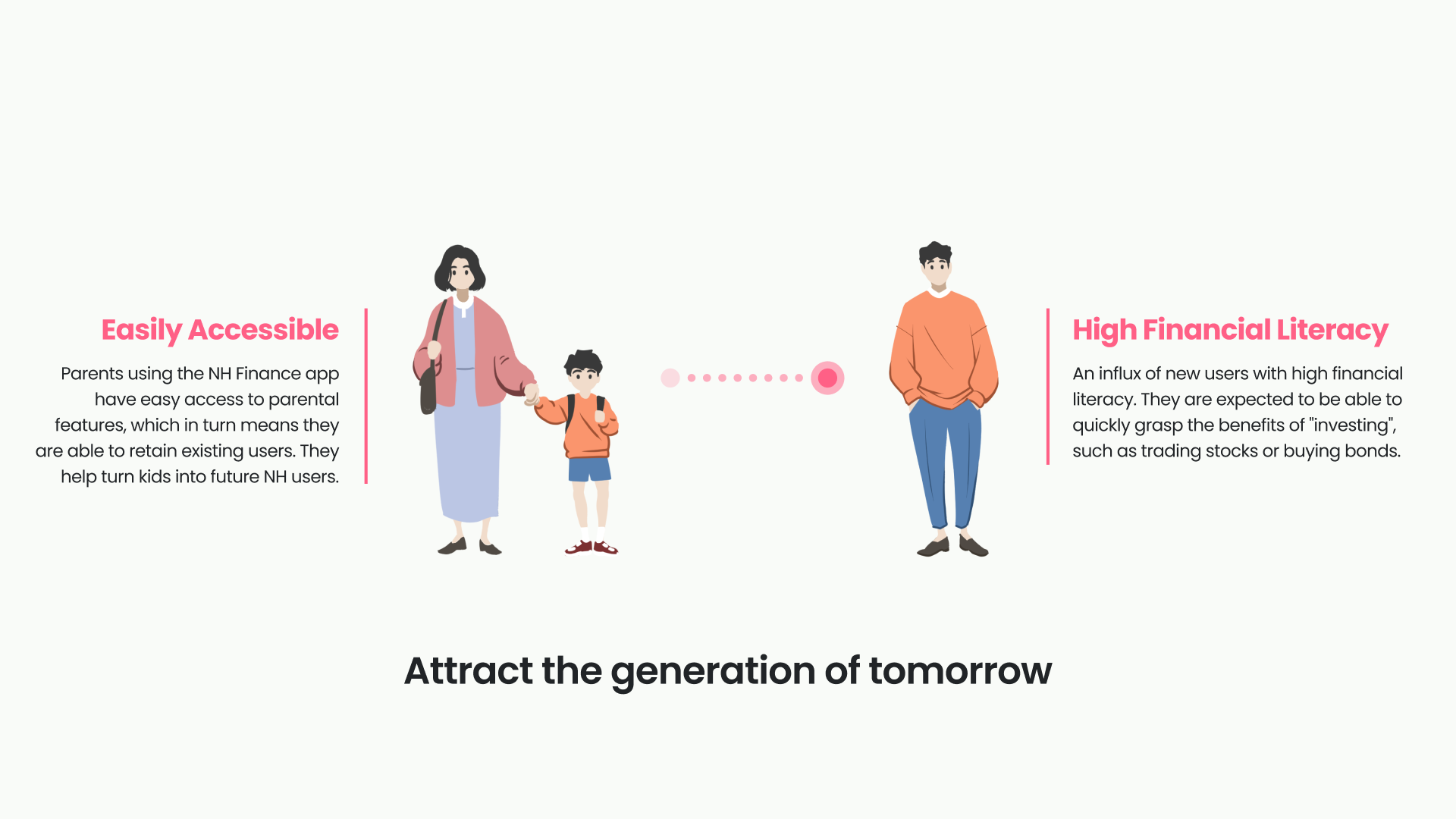
Attract the smart customers of tomorrow
With an easily accessible admin screen in NH’s existing app, parents can attract kids as future customers. With financial literacy, customers are expected to quickly see the benefits of “investing,” whether it’s trading stocks or buying bonds.
What I learned
- Making things easy to use is not easy
- Complete the whole project and refining over iterations is more effective than getting every details right in one go.
- Face-to-face meeting is uncomfortable and inconvenient, but it is fun and it is the best way to get things done.
I am the kind of person who likes to see how far the crazy ideas would go. So, often times I would ended up building upon others’ so-called dumb ideas rather than trying to find their limitations. This team is the first team that believe in the same principle as me. Every team member would try adding on to the ideas on the post-it board and rarely disregard any of them. It would started out sounding kinda funny but then we often ended up with beautiful and unique interactions.
This team showed me how powerful any ideas can be with a little bit of everyone's help.
What I wish were more explored
We had quite a short time period in developing this project. So, we rely so heavily on researches and surveys because extensive user testing and heuristics evaluation are not very feasible. I wish we had a little more time to make a testable prototype and conduct user tests to verify our design. However, I am satisfied with the progress we managed to achieve in such a short time frame. Maybe with more experience we can achieve more in the future.
If you are interested in a project with more emphasis on verifying design choices and user experience evaluation, check out my project