Baobal
August 2023 - December 2023
Teammates
Zhi Lin Yap
Damir Zhumatayev
Karen Dolmagambetov
Context
Have you ever feel like your to-do-note-taking-life-planning-work-grinding app is making you overwork? As an undergrad student, I often find myself scared of lacking behind others; whether it be in class, school activities, or career path. And I often hear my friend complain about the same thing; what if they work too little?
But rarely do someone ask themselves “Do I work too much?”
With the modern mindset that over-emphasize the importance of productivity, many have find themselves becoming a “workaholic”
is a person who works compulsively. A workaholic experiences an inability to limit the amount of time they spend on work despite negative consequences such as damage to their relationships or health.
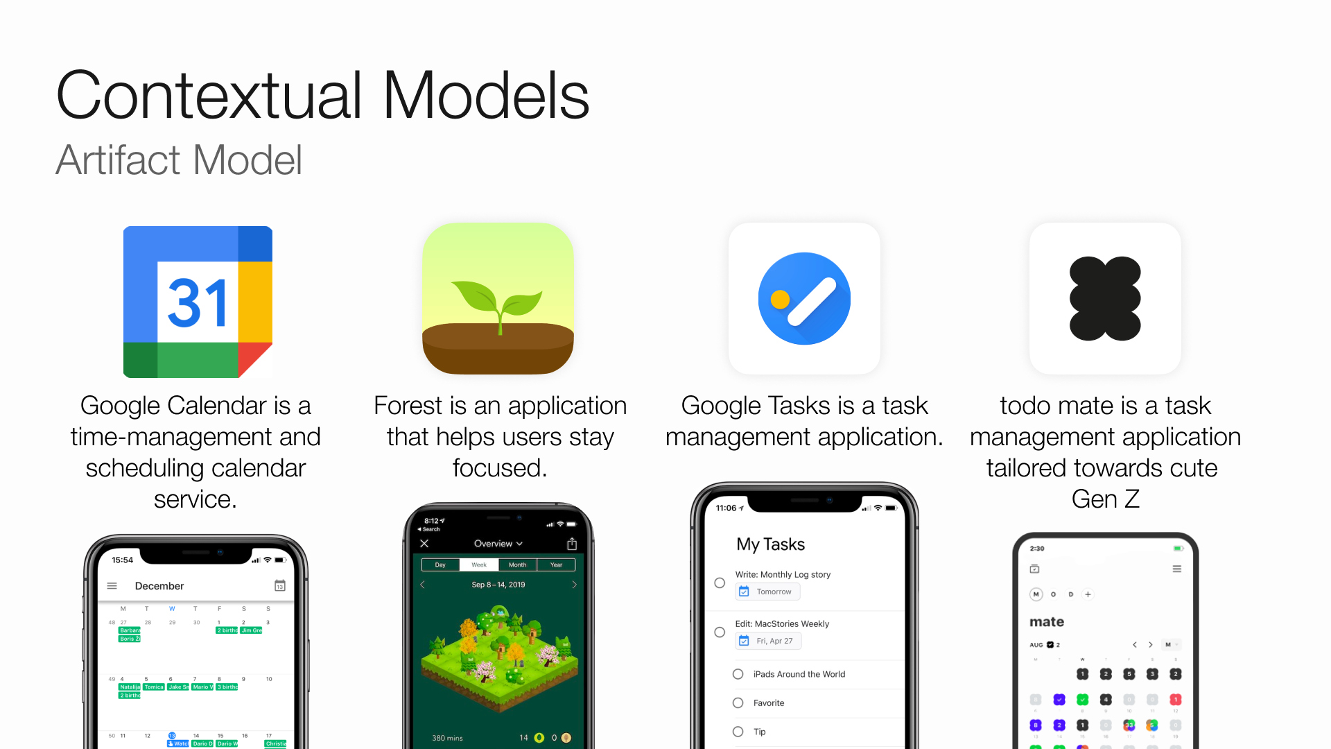
And one of the thing we noticed is that, while there are an abundance of productivity app that can help you work more, none of them can help you work less. And that is what we are trying to do in this project.
Needfinding
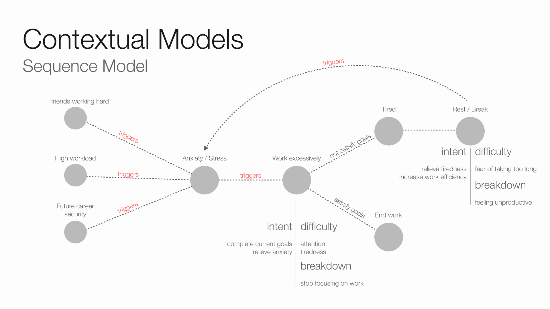
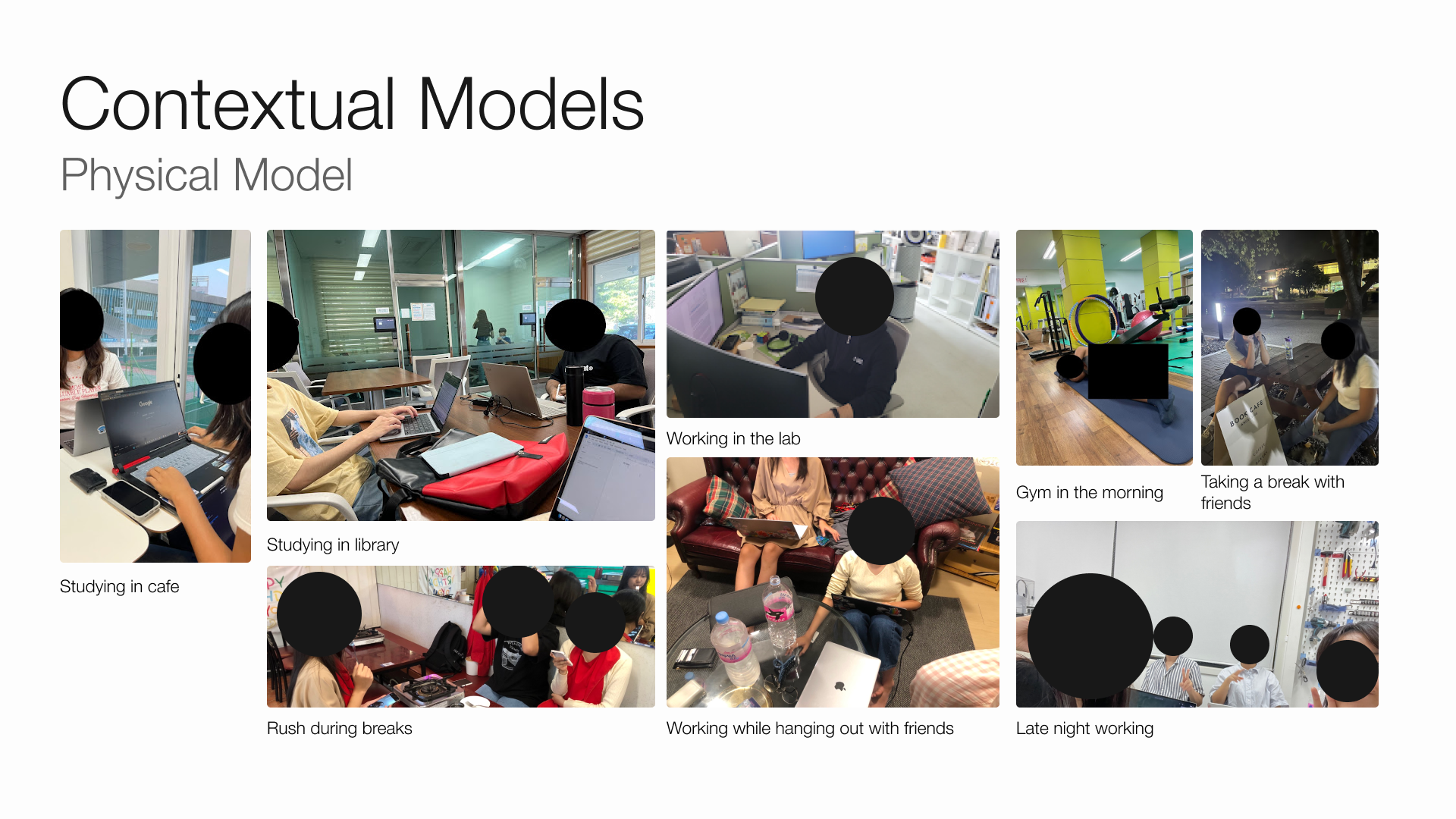
To identify the needs that out product has to satisfy, we conducted interviews with 9 potential target users; the workaholics. Then, we identify any interesting moments or remarks throughout the interview and develop our contextual models: sequence model, physical model, and artifact model.
Then we proceed to identify the needs from the insights we found in the model.
Needs
- They need for a sense of work-life integration, rather than strict separation
- They need to recognize that breaks are not bad
- They need a positive and motivating competitive environment
- They need consistent reassurance that they have worked hard
- They need to maintain focus and concentration
- They need a reliable support system from peers
- They need to manage anxiety stemming from concerns about productivity
- They need to actively track and manage work commitments
- They need to set achievable, realistic goals
- They need effective resting techniques, such as the Pomodoro method
- They require tools to measure progress and accomplishments
Ideation
Point of View
To better get the context of how our target user feels, we developed what’s called a “Point of View” of workaholics.
Young workaholics juggling between internships and studies need to moderate their pursuit of self-improvement through attainable goals and progress monitoring because their work perception can lead to excessive, unhealthy decisions.
Persona
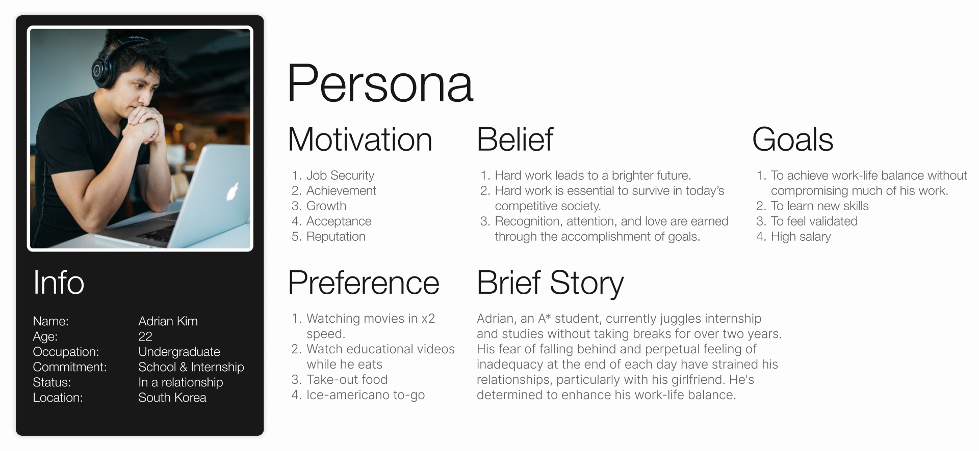
From the Point of View statement, we made a user persona for everybody in the team to be on the same page about who to design for.
How Might We’s
To better empathise with the user, it’s important to ask ourselves “How might we …” (or HMWs) questions that forces us to think in the target users’ shoes.
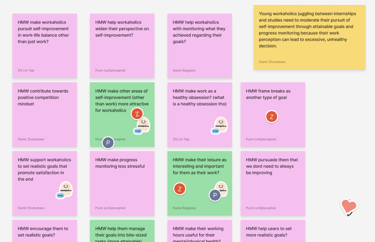
Then we selected 3 HMWs that we think best captures the target user struggles with these criteria:
- encourage creative problem-solving
- focus on user’s needs
- does not suggest solutions

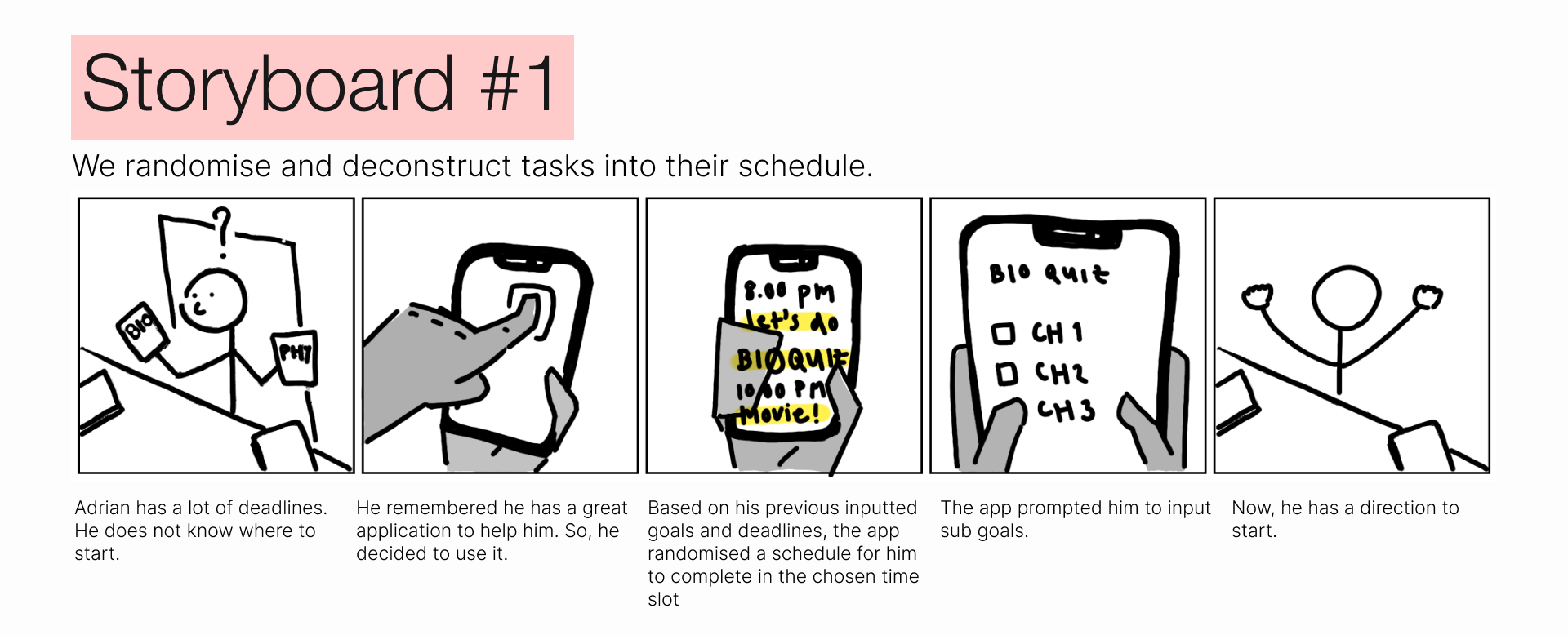
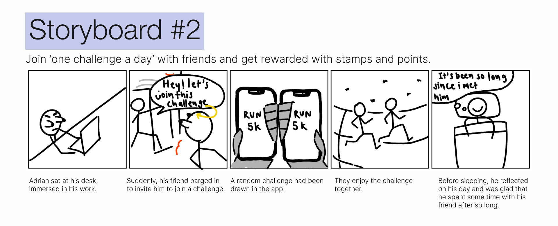
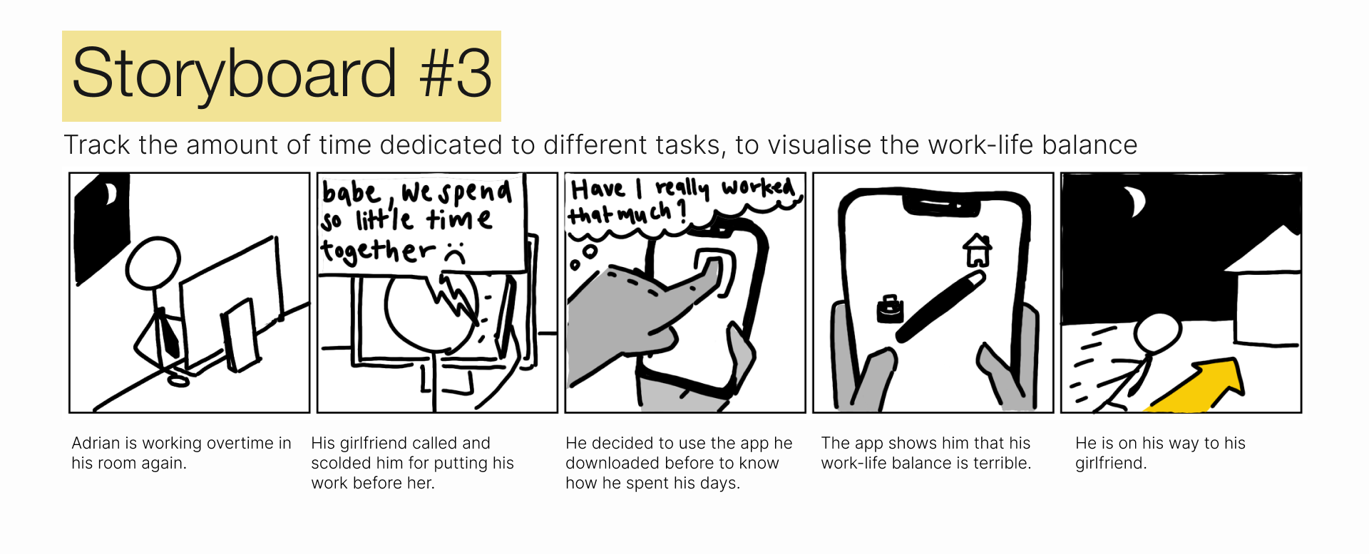
We tried to come up with as many solution as we can for each HMWs and picked 3 best solutions and draw a user scenario storyboard for each one of them.
We got stuck staring at the HMWs board for some time. Ideas come and go. Some good, some bad; but none really hits. You know — when you brainstormed and all the ideas are… okay but none slaps yet. Until someone said “If workaholics often forgot how imbalanced their life is, how about we really show them the imbalance.”
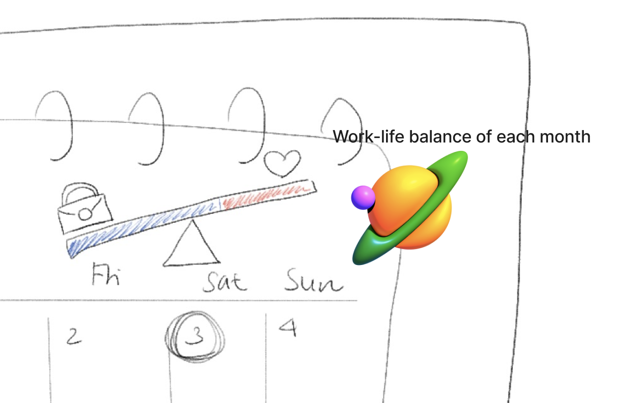
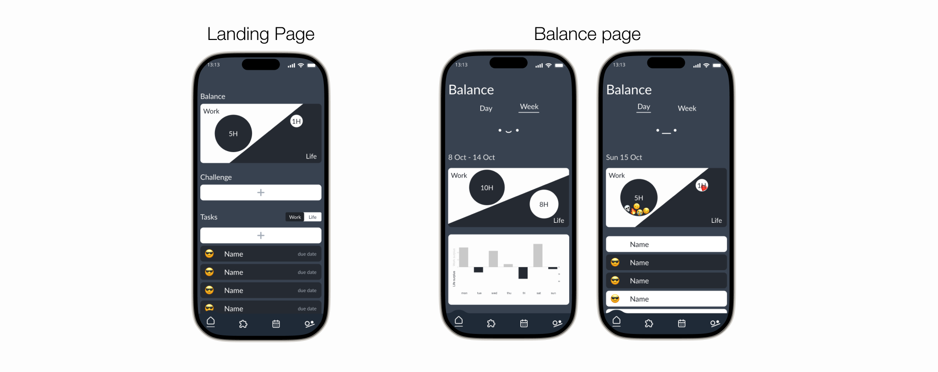
So, the idea of mapping abstract concept, like time, to a more concrete concept, like weight, kind of become the central theme of our application. The visualization makes the imbalance of their life more digestible, relatable, and … somewhat more dramatic.
3 Best Solutions
- We randomise and deconstruct tasks into their schedule
- Join ‘one challenge a day’ with friends and get rewarded with stamps and points
- Track the amount of time dedicated to different tasks to visualise the work-life balance
Storyboards
Prototyping
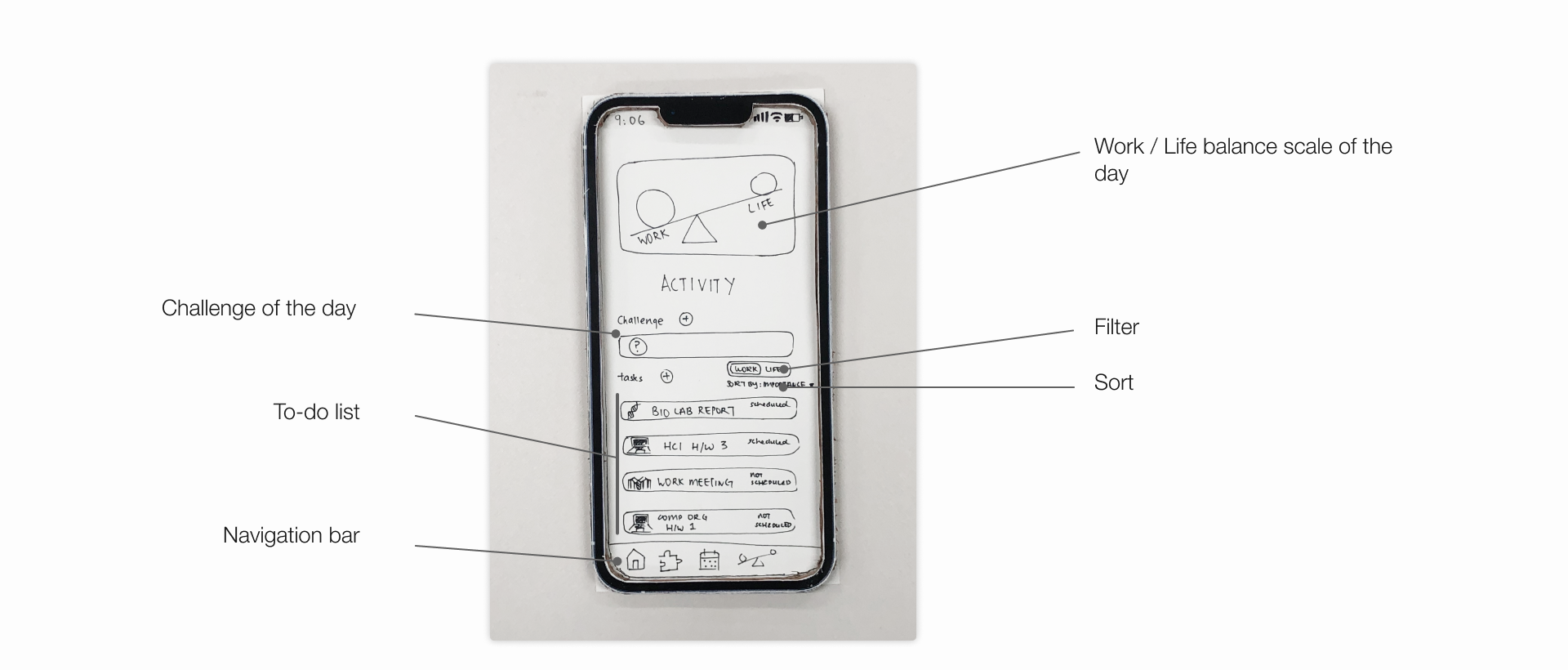
So with the main solutions agreed upon, we work on translating those solutions into low-fi UI screens and wireframes.
Low-Fidelity (Paper)
After we finish the early design, we made a quick paper prototype to verify it before moving on to higher fidelity prototypes.
We chose paper prototype because it is:
- faster to build: sketching is faster than programming
- easier to change: lower investment and easy to make changes between user tests, or even during a user test. This also makes people more ready to criticize because it is less burdensome to make changes.
- focus on the big picture: designers don’t waste time on details and customer can make more creative suggestion on the interaction
- non-programmers can help: designers who don’t have experience in programming can do a hands-on help
The prototype is made in a way that can support the verification of 4 tasks that appears in the end-to-end scenarios captured in the storyboards
Tasks
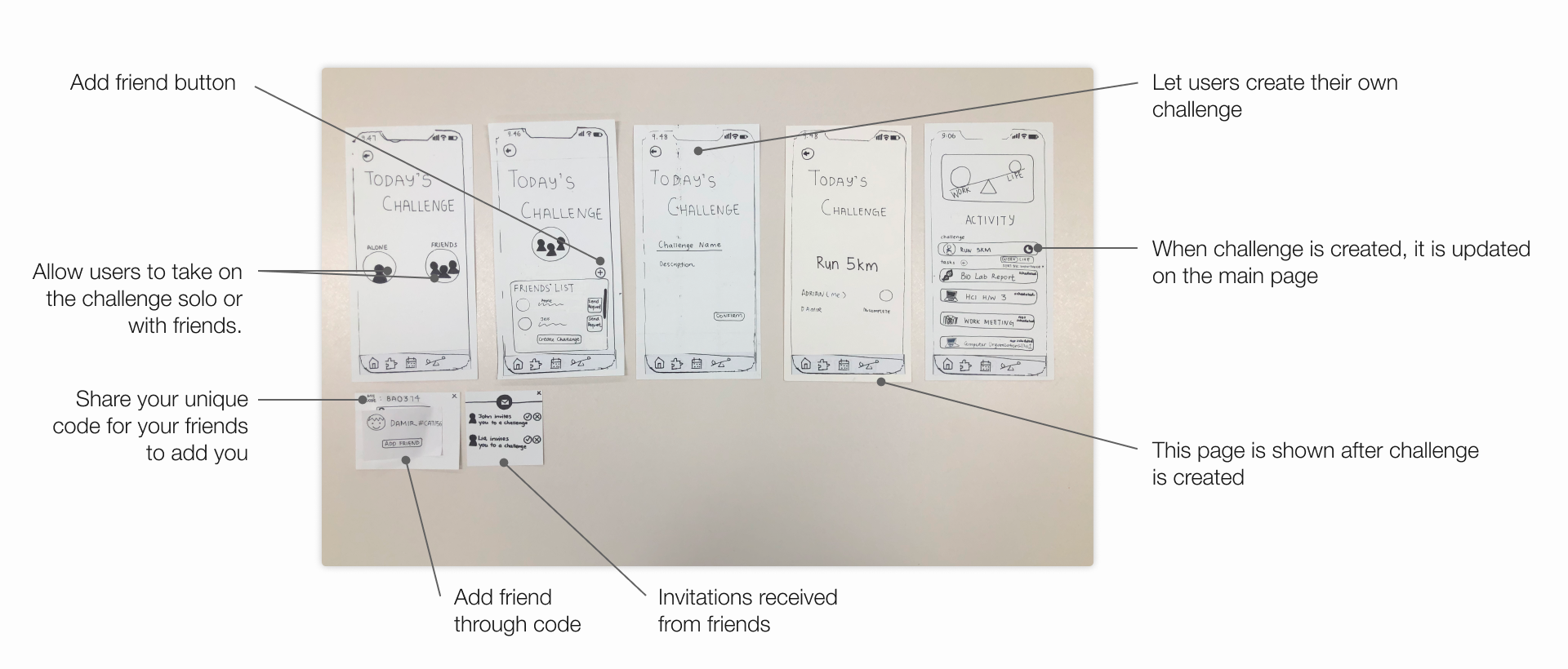
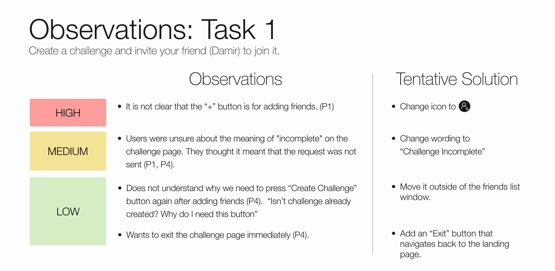
- Create a challenge and invite your friend to join it.
- Add a task to your to-do list
- Schedule a time in your calendar to complete your task
- Check your work-life balance
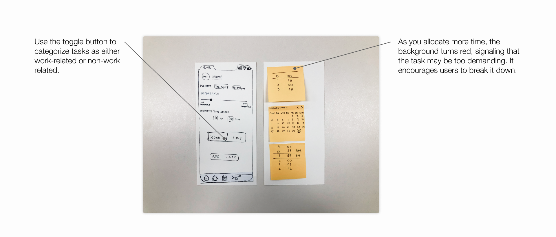
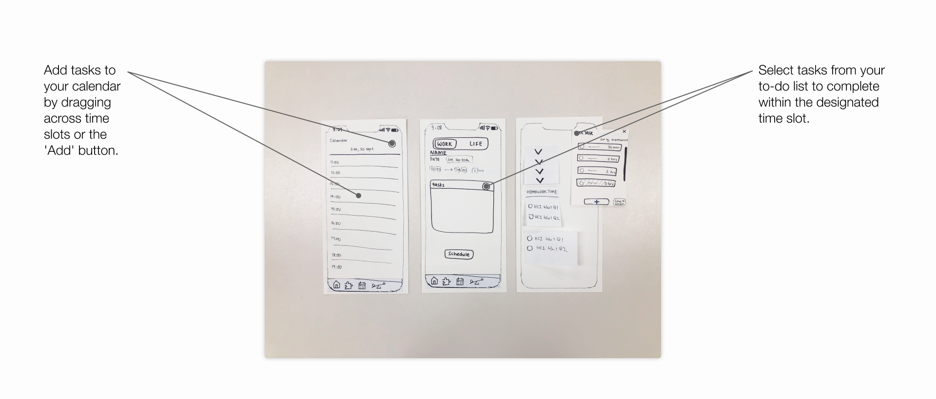
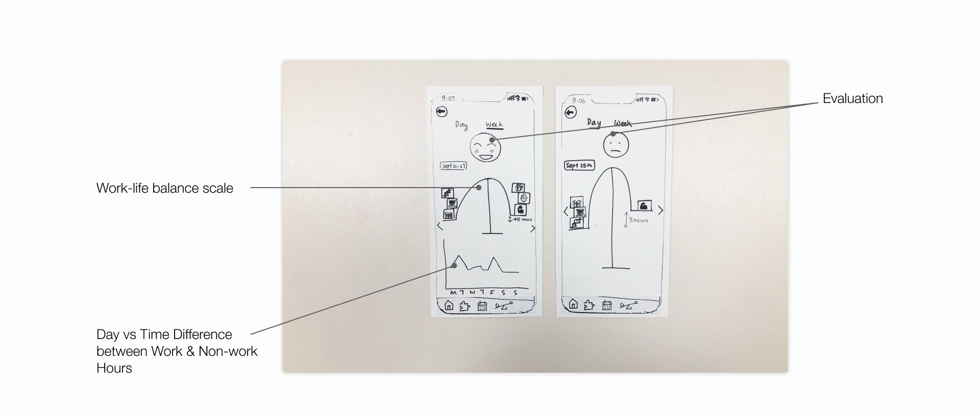
Screens for Paper Prototype
We asked 4 participants to participate in this prototype testing. First, we gave them a short briefing and then asked them to complete the 4 tasks mentioned before.
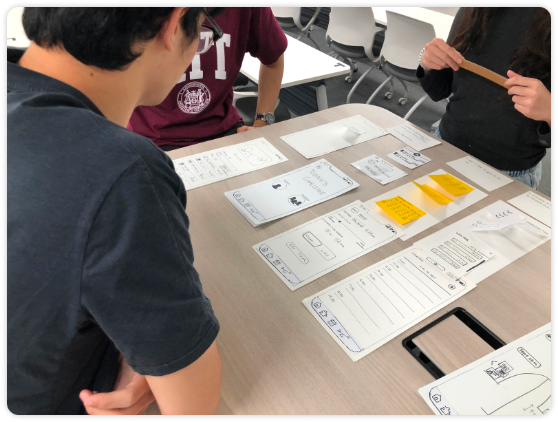
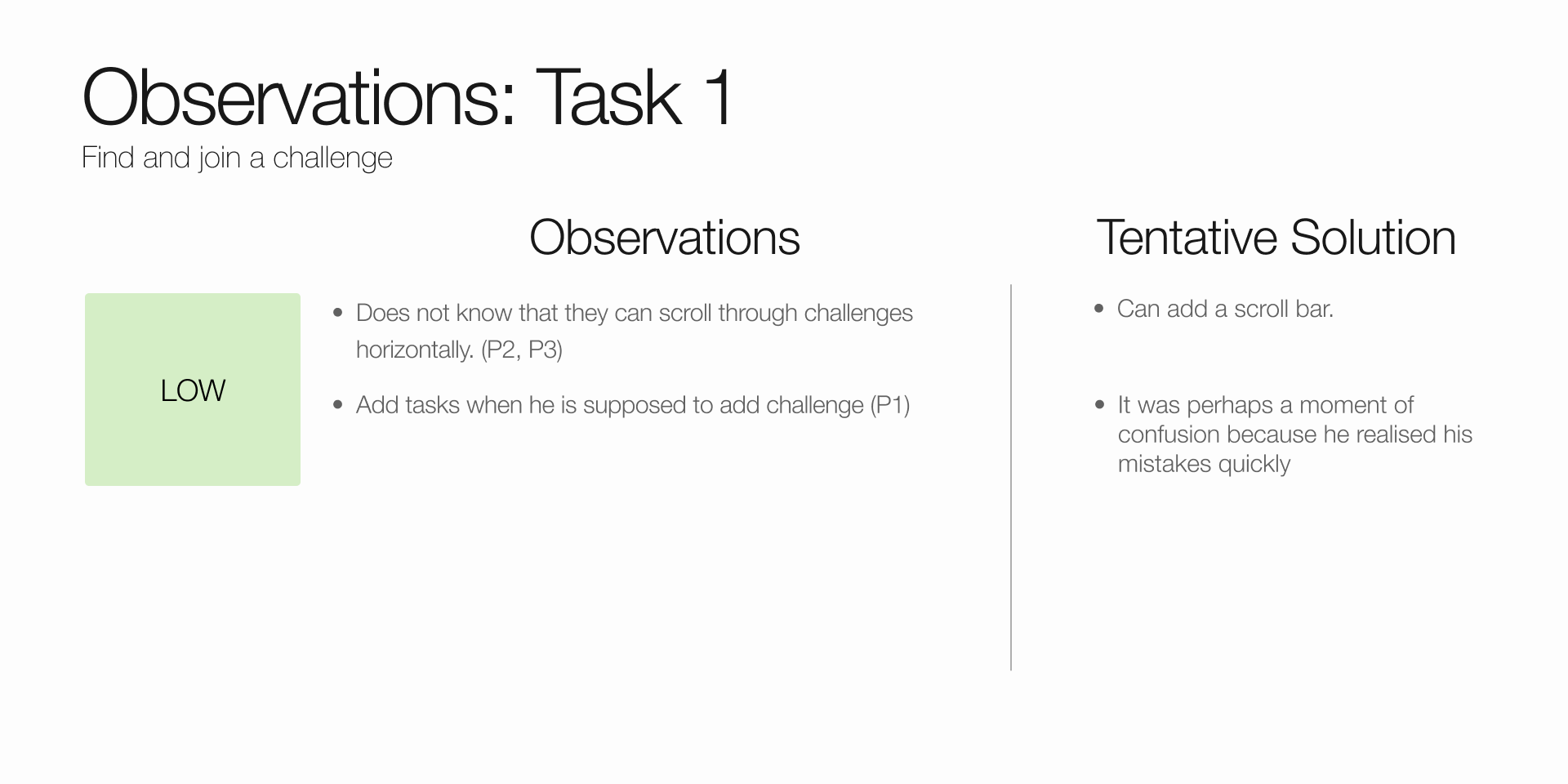
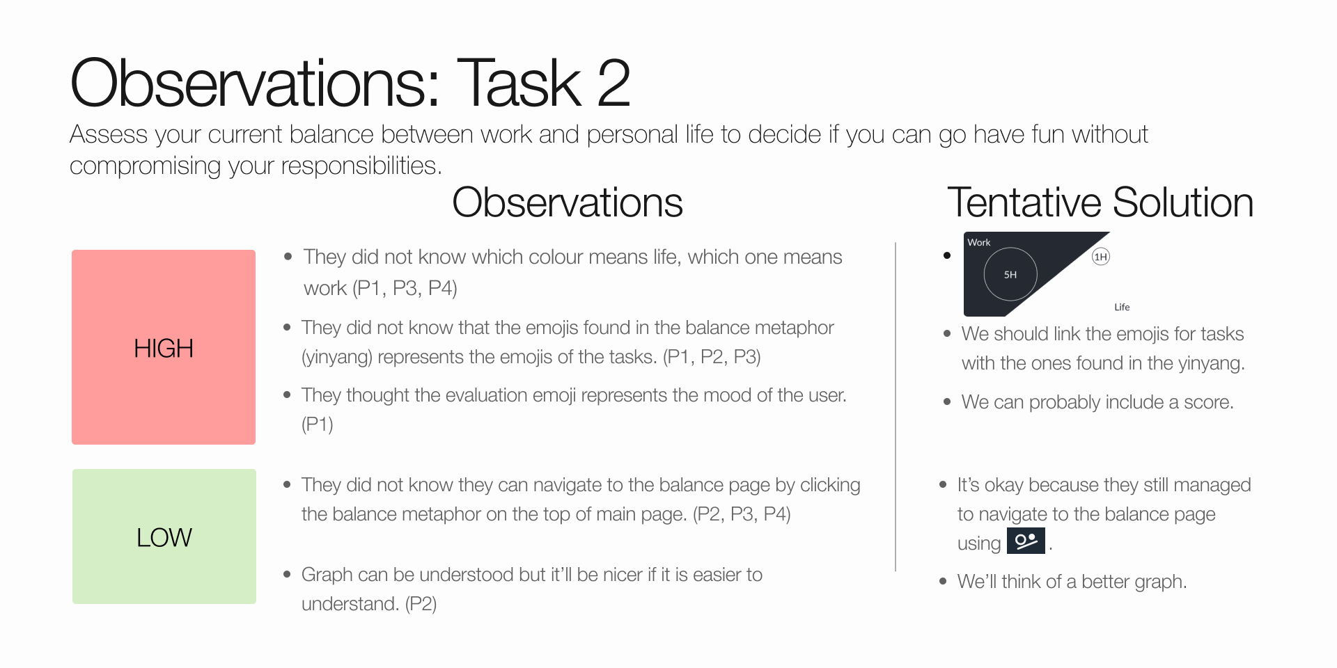
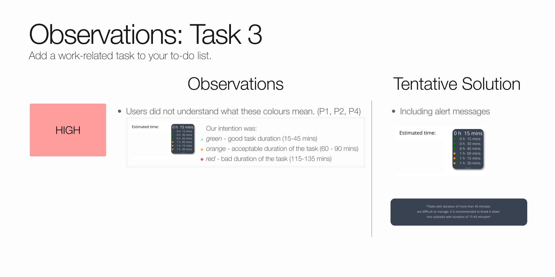
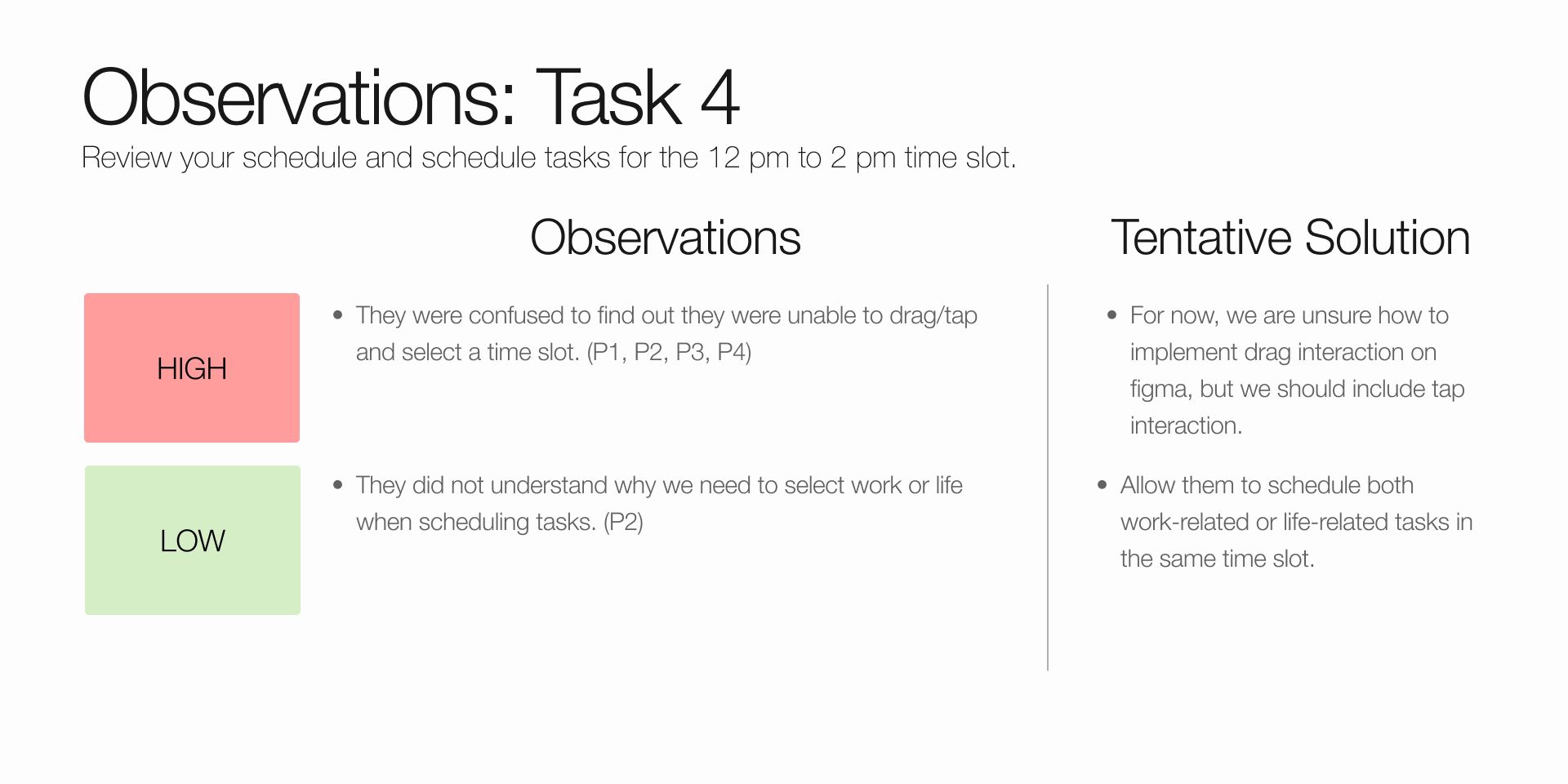
The observations gathered from the user testing were then categorized according to their severity: High, Medium, Low. The rating criteria is
- High: Occurs when significant confusion arises for participants during the completion of major tasks.
- Medium: Encompasses minor inconveniences or slight confusion that participants may encounter when performing tasks.
- Low: Refers to inconveniences that do not obstruct the completion of necessary tasks.
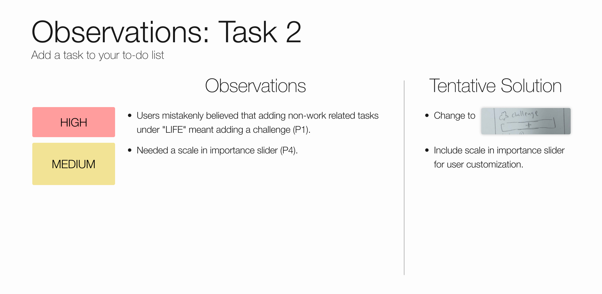
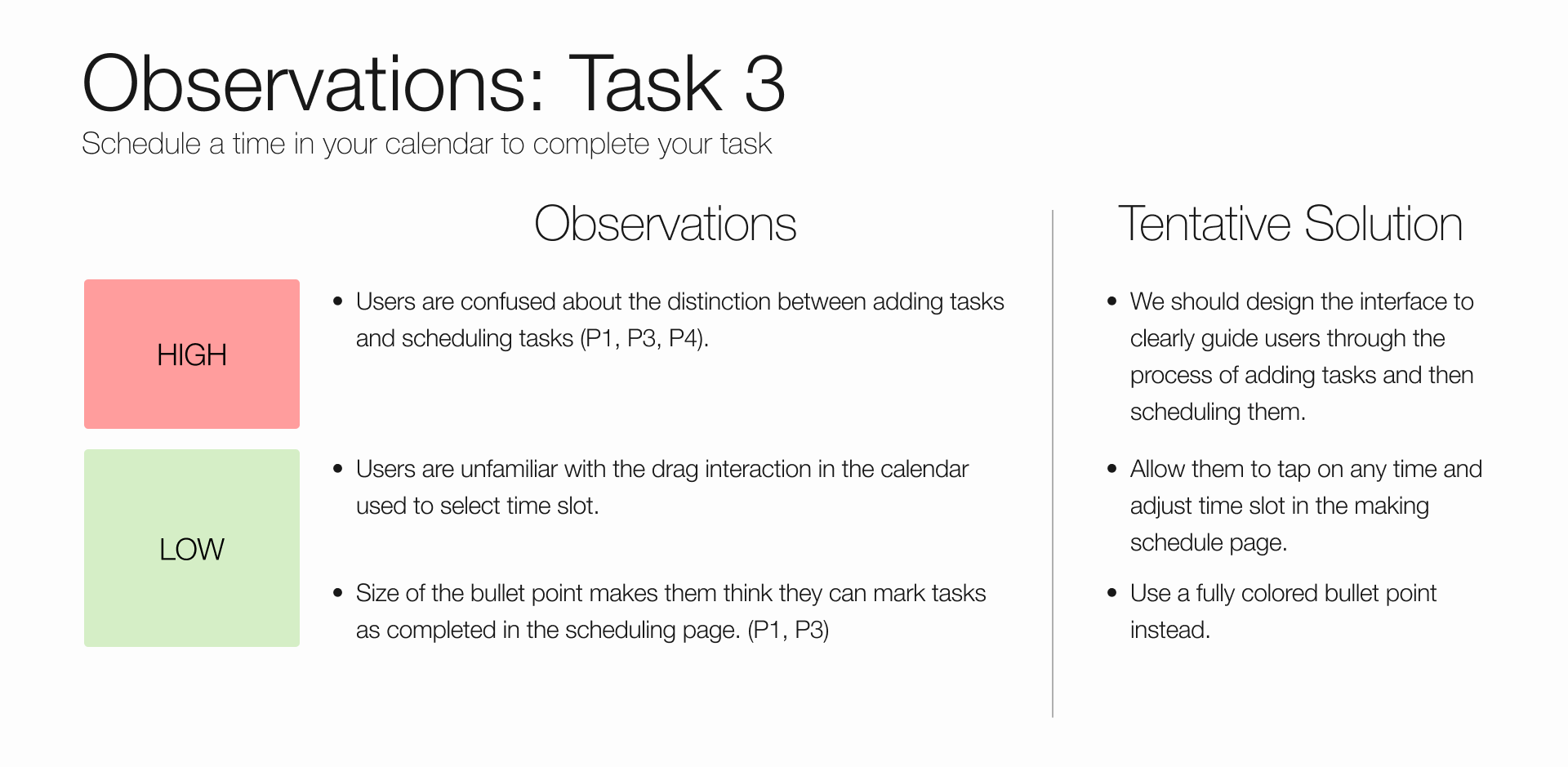
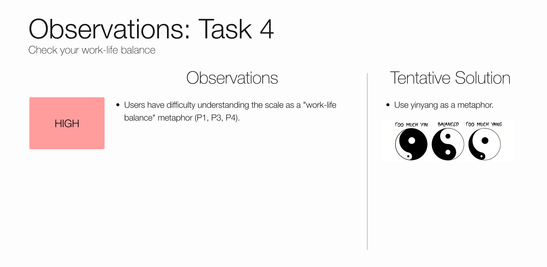
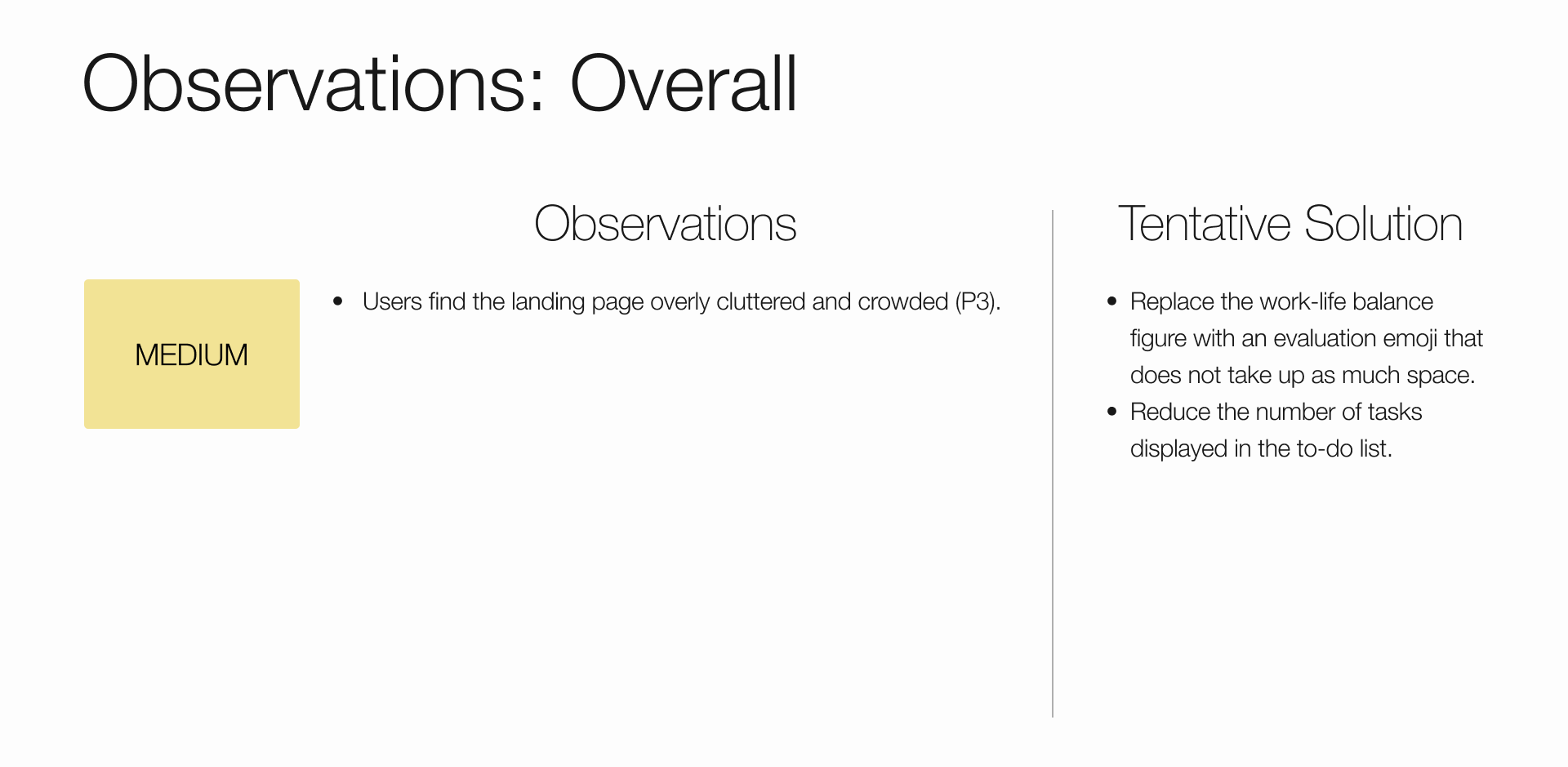
Observations
Then, we brainstormed solutions to patch them.
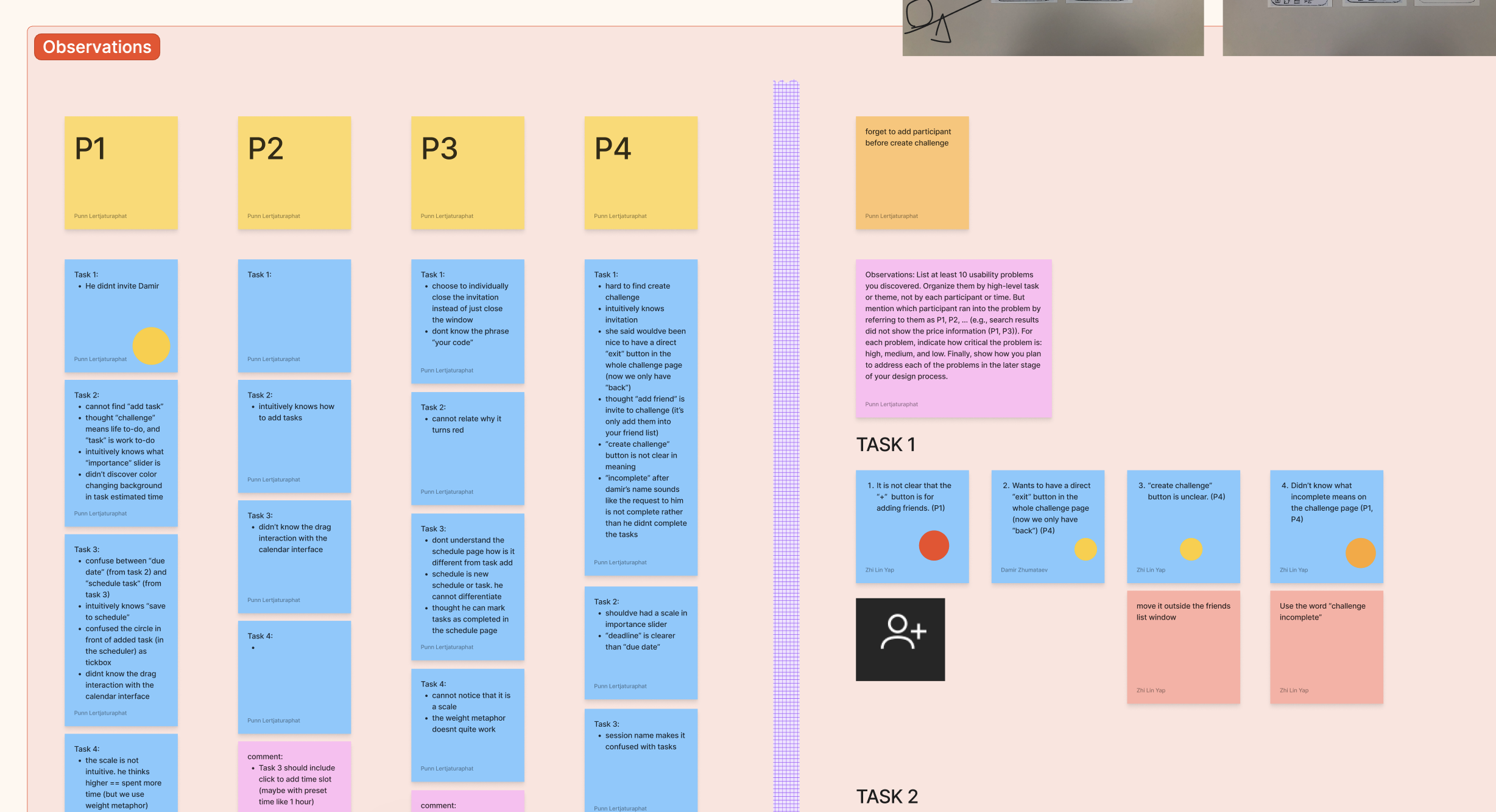
This stage is one of the most interesting part of UX/HCI research for me. I never thought that presenting a low-fidelity prototype for user testing is a good idea. As a tidy person myself, I prefer showing finished and polished works and ask for others opinion. But performing paper prototype user testing change my perspective on that.
When I show unfinished rough-on-the-edges kind of works, people tend to feel that it is the early stage of development. And because of that they are more likely to suggest changes that are more radical and creative because for that kind of work change is easy. Whereas if I show a very finished product and every detail is polished, they think that "well, at this point, the change wouldn't worth much".
High-Fidelity (Digital)
With the details of core user experience (navigation, metaphor, UI element placement) established in paper prototype, we move on to the finer details like interactive feedback, efficiency issues, and layout.
We choose to implement our interface in digital prototype to identify those usability issue.
Tasks
- Join challenge
- Create task
- Schedule task
- Check balance
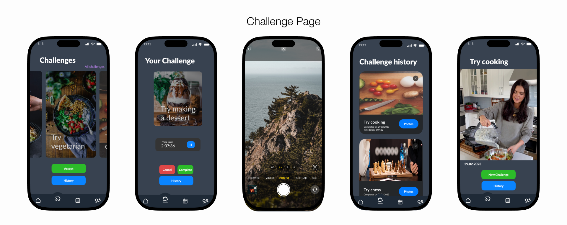
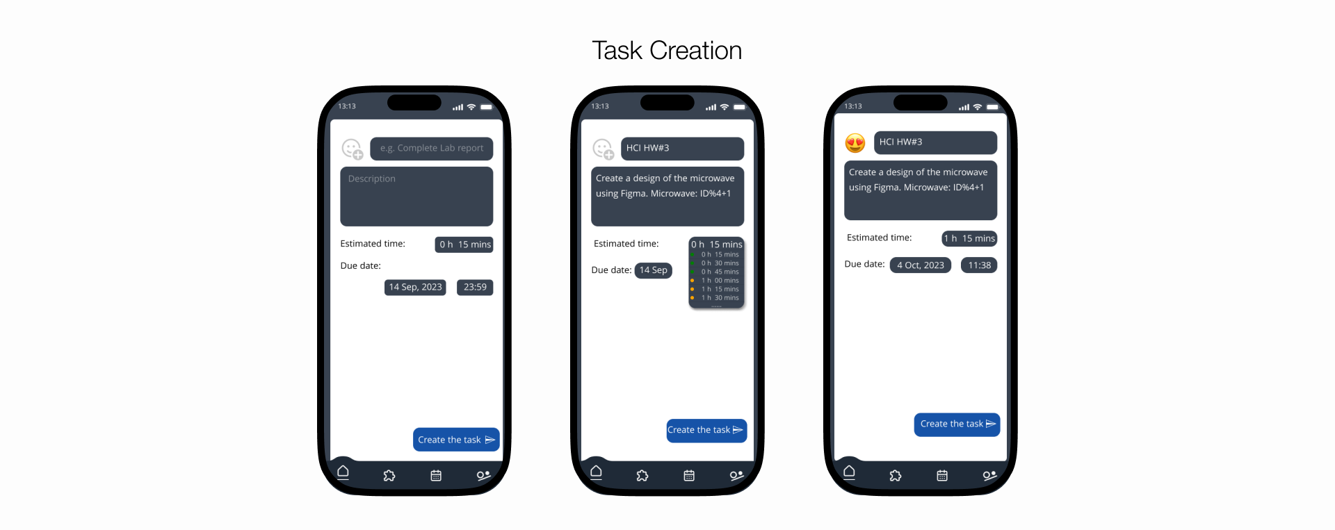
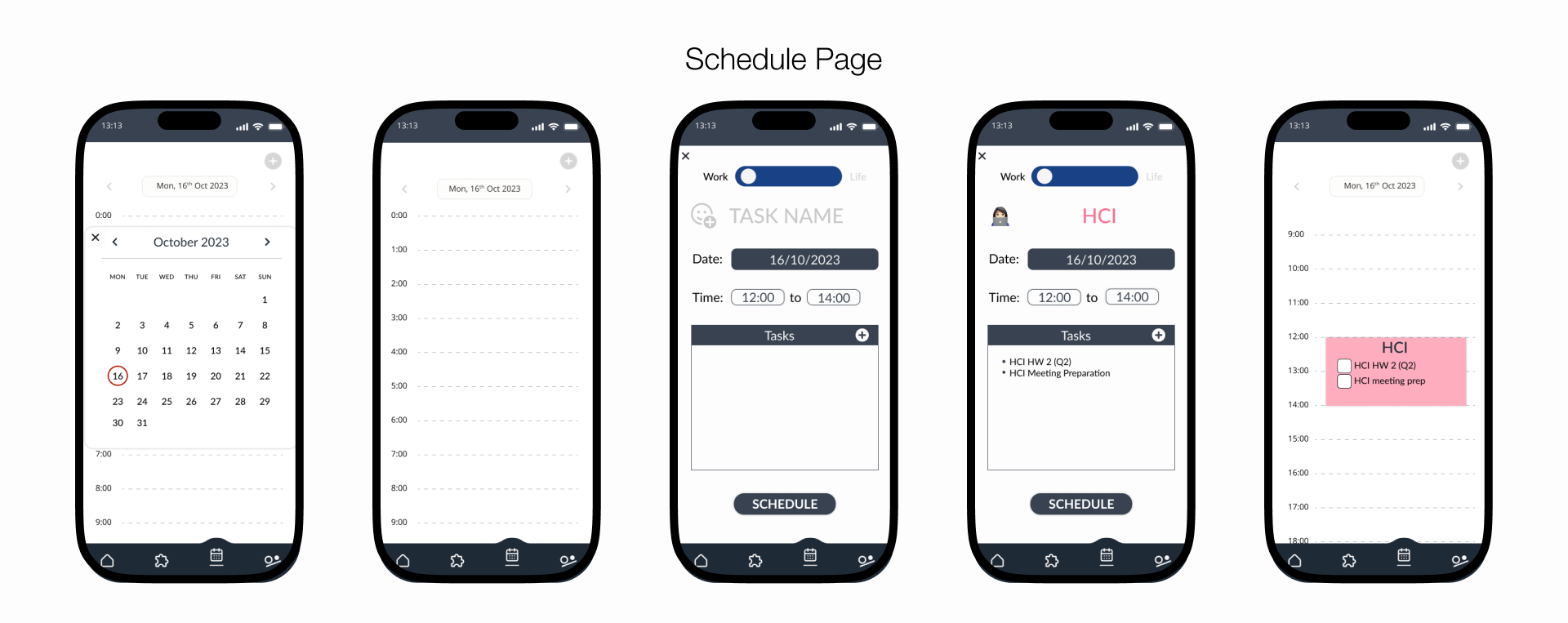
Screens for Digital Prototype
Even thought this version is a more “polished” version than the paper prototype, some corners are cut for efficiency.
We intentionally refrained from including detailed hard-coded data for tasks in our design. Our rationale was to prevent overwhelming users with unrelated content. Instead, we aimed to keep the focus squarely on the core concept and functionality of our design.
Observations
And, the same as paper prototype, we categorized the observation into 3 severity using the same criteria and then tried to come up with solutions for each of them.
User Testing
Now, after all the revision and polishing, we reached the late stage of prototyping. Unlike paper prototype and digital prototype where only tasks for chosen scenarios work, most of the functionalites of this prototype are clearly defined and most of the core interaction work.
So, this test place more focus on improving the interface rather than testing the interaction. We put together a protocol document for the test that serves as a test documentation as well as a concrete plan for the test execution.
Test Protocol
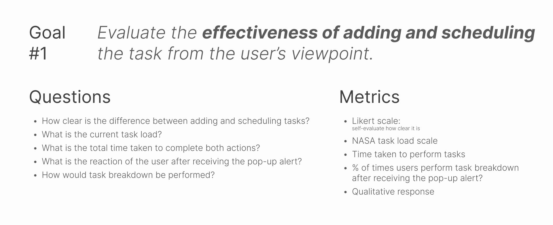
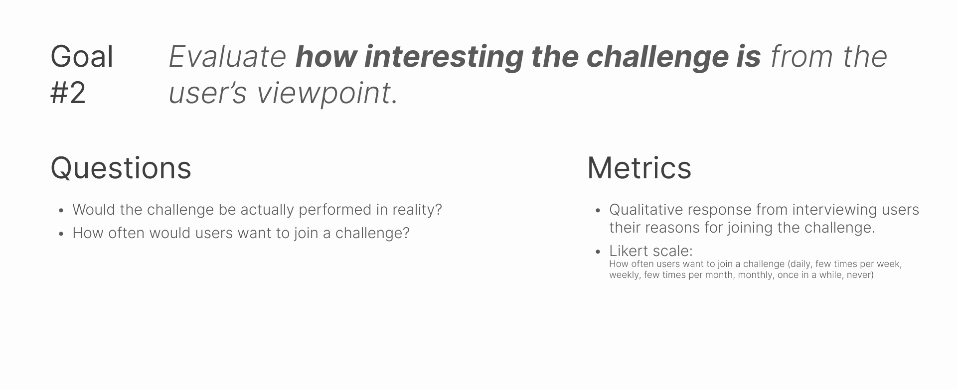
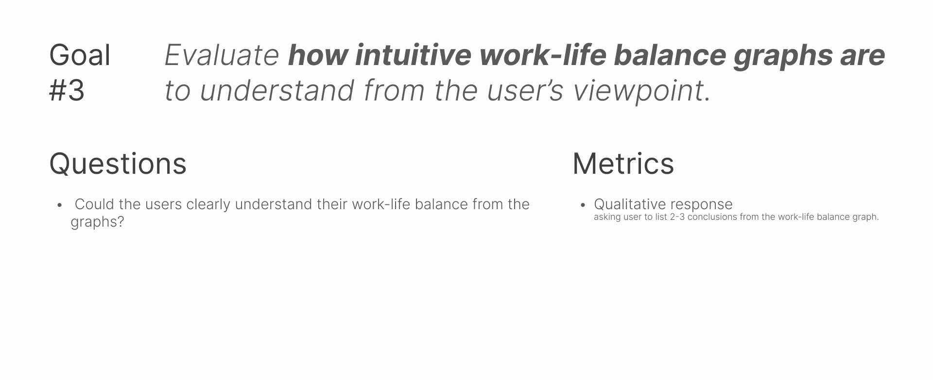
We defined the goal we want to achieve, what questions help verify those goals, and what metrics we should use to measure the questions.
We use our previously mentioned user persona as our user profile.
The methods we will use for collecting the test result are:
- Think aloud
- Interviews
- Survey questions
- Likert scale
- NASA task load index
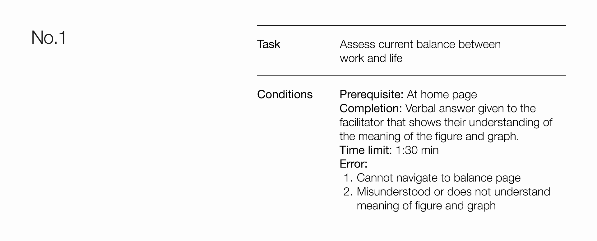
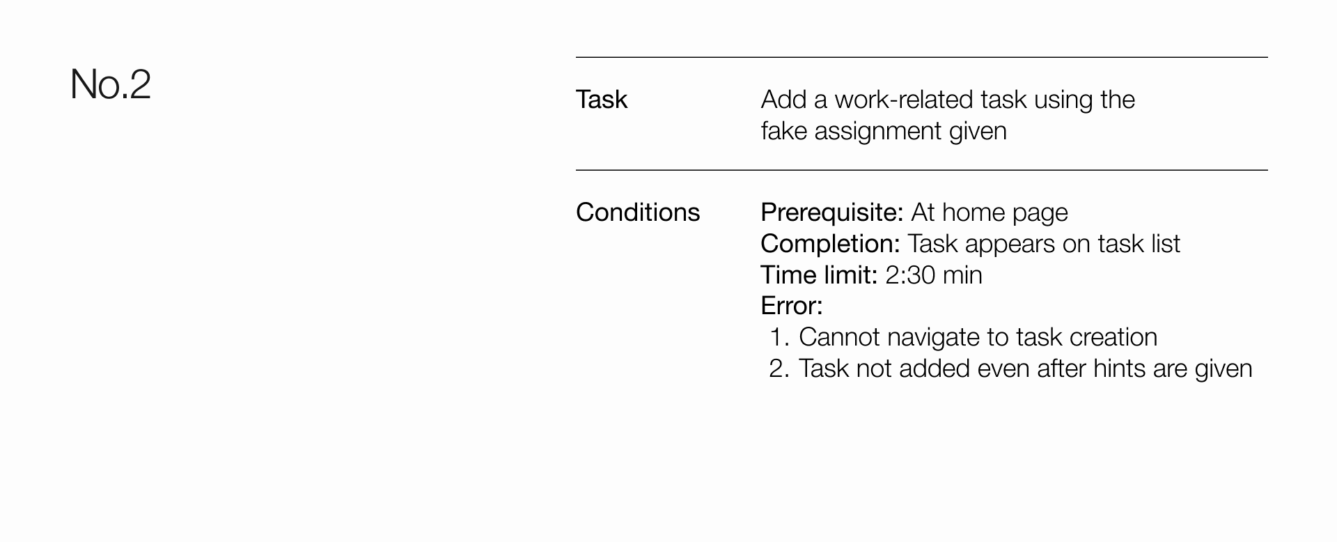
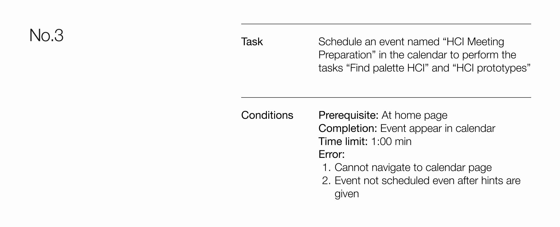
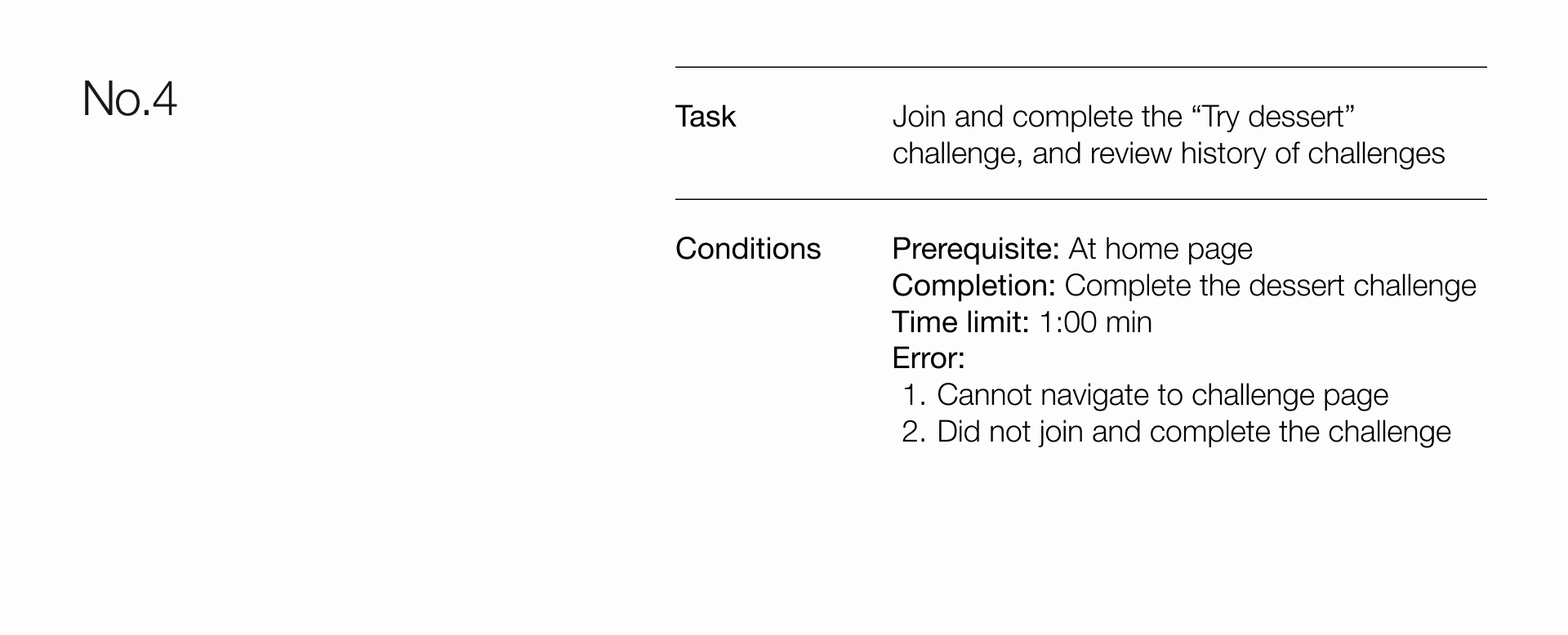
The 4 main tasks to be perform along with conditions are:
You can try performing the tasks yourself with this prototype!
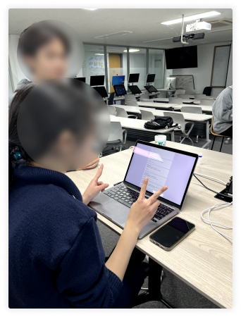
We choose test users based on the defined characteristics of representative users:
- Undergraduate students
- Overwhelmed with work. Working in lab, internship, etc, while also dealing with academic responsibility
- Strive to regain work - life balance
The whole protocol along with the script can be found here
Result
Similarly to previous two prototypes, we concluded our observations and reflected on the study process. I feel like the observations are too detailed to be mentioned here so if you want to check them out you can do so by looking at the slides
What I want to share are the takeaways from this user testing session.
Performing a real structured user testing, I can see insights that I wouldn’t know had I never done it. It’s one thing to learn about it in the classroom but to really prepare for it and think about the process in a real project feels a lot different for me. I learned that:
- Surprisingly, it is very hard not to impact or influence the user decision while testing.
- They might feel inclined to give positive feedback when they are aware of being recorded and observed.
- Their needs can be more diverse than I expected (no matter how big i expected, it always exceeded that!)
Final Product
To recap before diving into the solutions, I want to mention the How Might We questions once again and our solution approach them.

And we answered all those How Might We’s in the interface. Let me explain those answers as the How Did We’s
How did we make their leisure as important as their work?
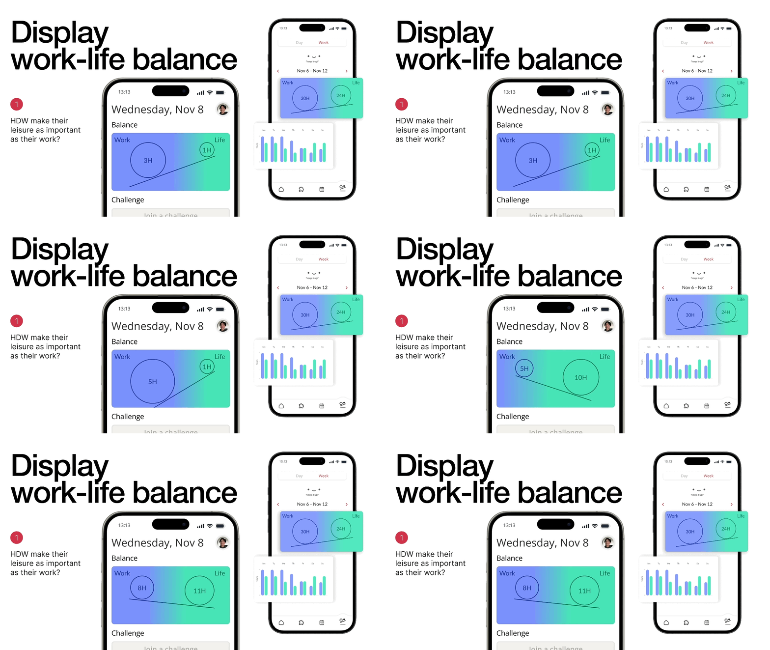
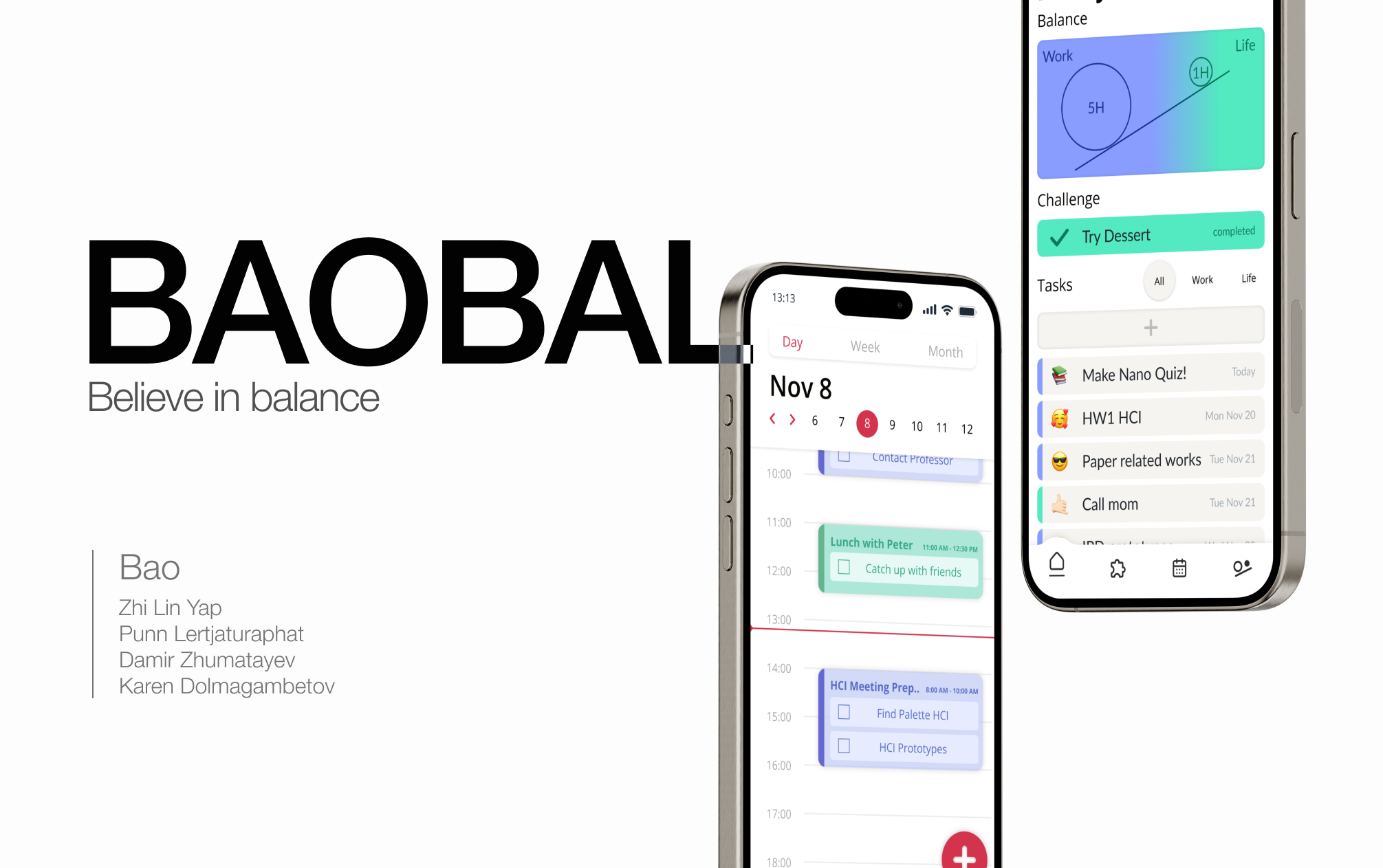
The proportion of their completed work-related tasks to life-related tasks is displayed in see-saw scale to emphasize the notion of imbalance between the two kinds of task.
How did we help them turn their goals into something more attainable?
We let them categorize the task they add to the to-do list as a work-task or a life-task and color coded the two. A filter can be applied to see only one of the two kinds of task.
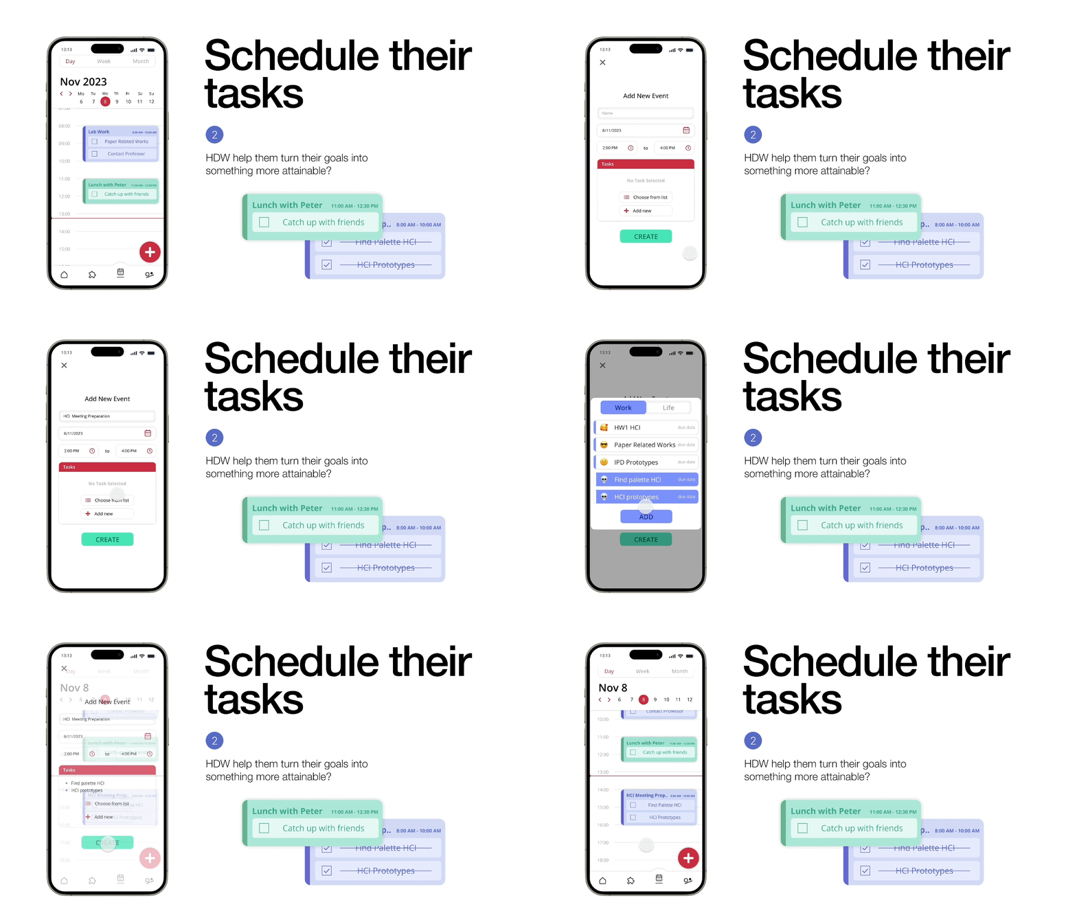
The user can schedule time specific tasks into a calendar interface. From the needs that we listed, we try to address the user’s need to actively track and manage commitments by this list interface.
How did we make other areas of self-improvement more attractive?
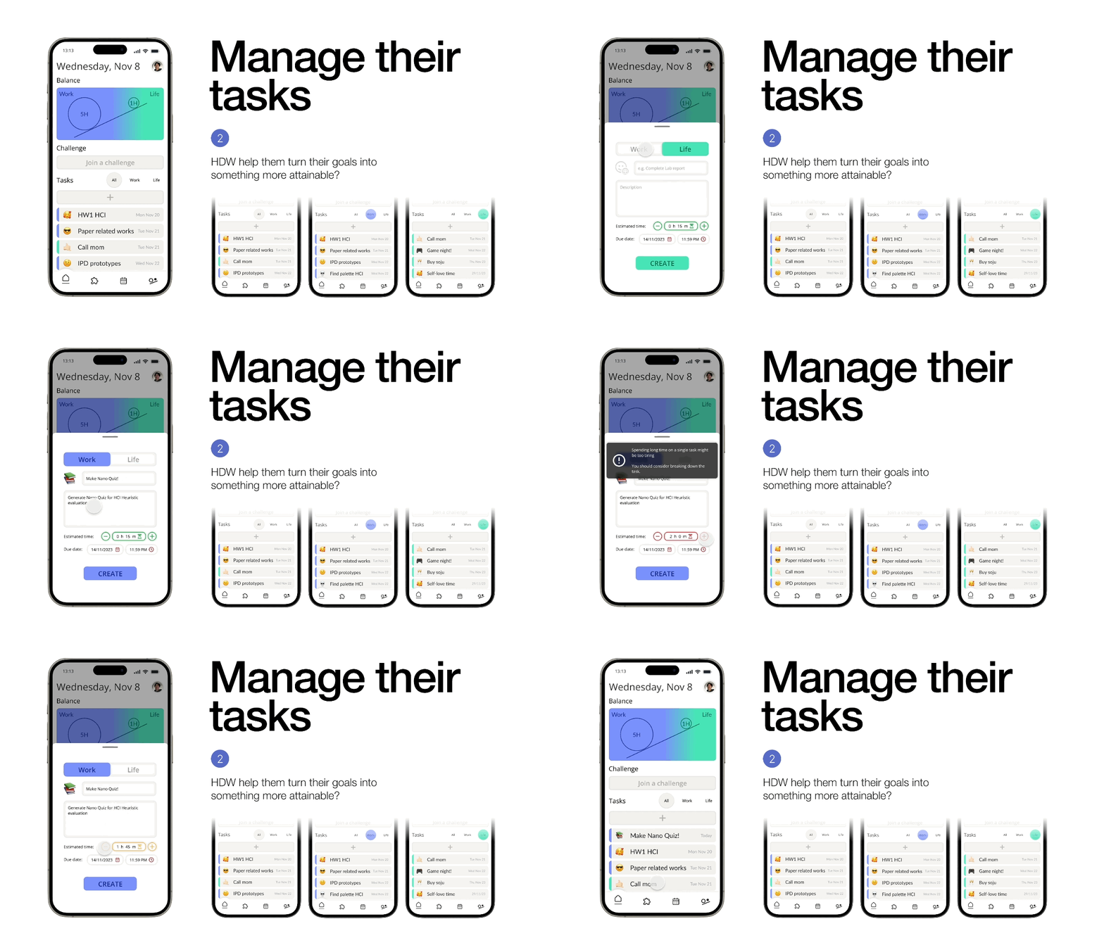
We included a section dedicated to challenges that user can join and complete. The user can participate in completing one challenge a day and log their journey of challenges. There is a section dedicated to recommending challenges the user may like and another section dedicated to recommending challenges outside the user’s comfort zone.
What I learned
Conducting this project helped me reflected on many valuable insights that I am grateful for. I got the opportunity to try to conduct the procedural way of user experience / human-computer interaction research. I learned how to identify needs and develop the solutions to answer them. I verifed those solutions by performing user tests on prototypes of vary fidelity. I learned how to be systematic about user tests and observations.
Ultimately, I got yet another lesson on teamwork.
Normally, I would be in a team full of designers with strong passion to deliver the best user experience who likes to let our imagination run wild with little notion of practicality. In this team, I was surrounded by developers and computer science major students. And they showed me different perspective that I would never see in other teams. Of course, it's fun to dream big but sometimes being nudge by the people who build it can give you a better design constrains in real world. And in return I think I also gave them the courage to dream. That is what "designer" means to me. Not the person with the ability to create, but the one who brings out the creativity of everybody in the team.
What I wish were more explored
Because prototype offers so little to explore, I wish we can get to early implementation stage and conduct another user study with semi-implemented product. I want to see how a feature is tested before launch using evaluative UX method in larger scale (like tree test, AB test)
I wish we can get a glimpse of how all of this documentation get passed on to the implementation stage. I want to see how the developers deal with these information and what role do designers play in the next step. I want to see how my concept can be brought alive as a real world product.
